 Home

Student Essay Review
An essay review flow where GrantMe held the Google Docs, so editors could get through peak deadlines without adding people.
- Role
- Lead UI/UX designer
- Year
- 2020–2021
- Team
- Junior designer, PM, lead engineer
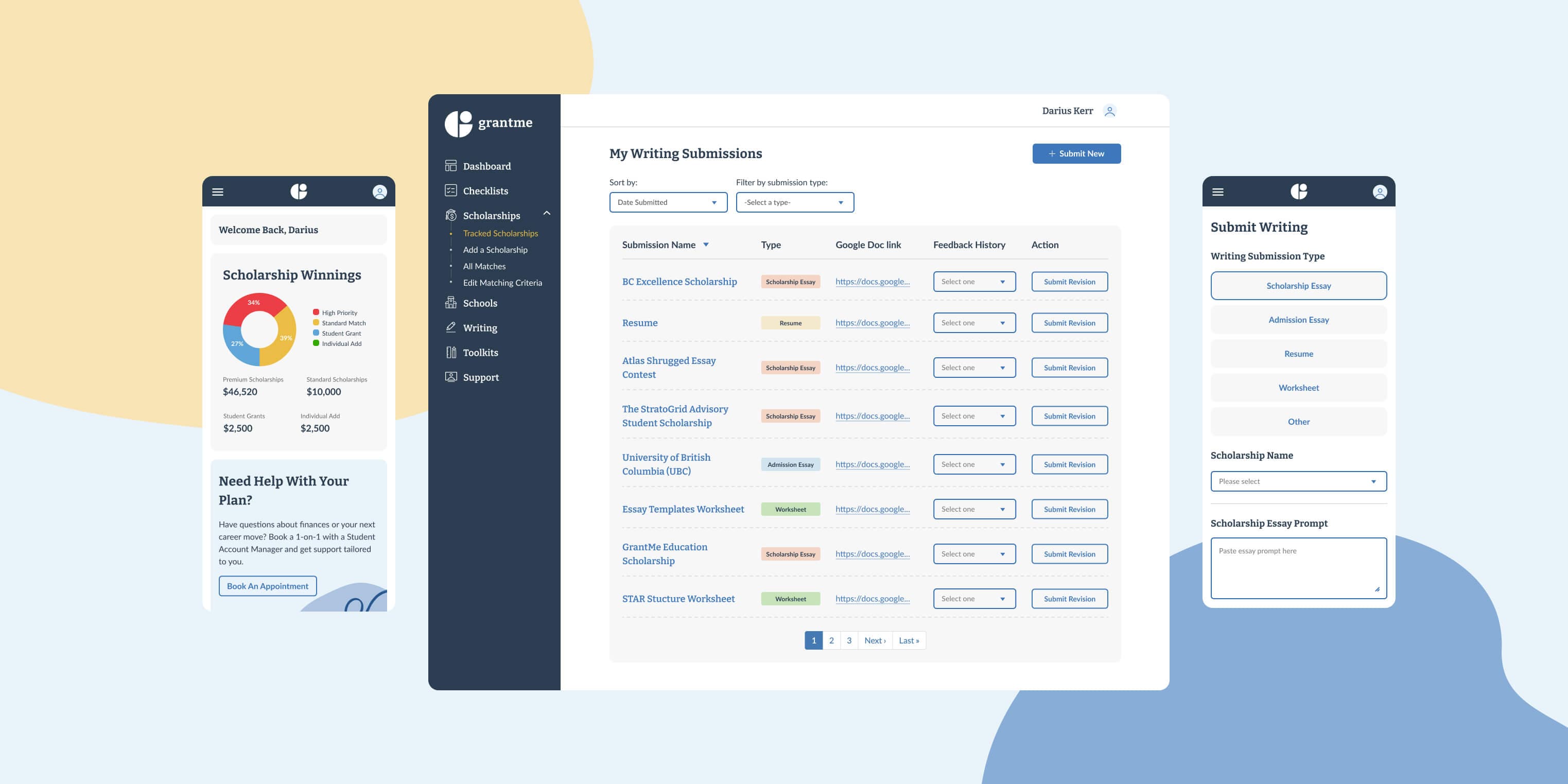
170 essays a day across three tools
At peak deadlines, editors at GrantMe reviewed up to 170 essays a day. To get one of those reviews, a student filled in a form and pasted a Google Doc link. Zapier and Trello sent it to an editor, and the feedback came back as comments in the Doc plus a text.
GrantMe helps students get into scholarship and admissions programs, and essay coaching is the core of that service. Every handoff relied on someone remembering a manual step, which got slow at that volume. We needed turnaround and cost low enough to handle the peaks without adding editors, and we didn’t want to ask anyone to learn a new system.
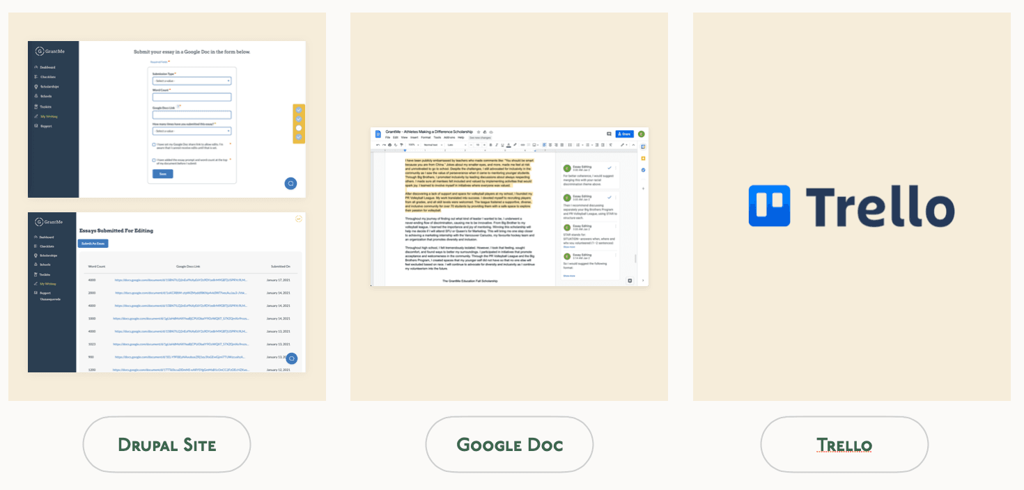
A record that lived in the student’s Doc
The audit showed the mechanics. Students filled in the same form for every new essay, and editors chased Doc permissions before they could start. I interviewed students, and since I hadn’t worked on the editing side before, I set up a separate session with the editor leads.
I have a hard time knowing which essays I have submitted because all I see is the Google Docs links.
Sometimes students would delete our scores and comments on the Google Docs which result in inconsistent scores.
Both sides were describing the same thing. The only record of a submission and its feedback sat in a Doc the student controlled and could edit.
Leading the design work
I led the UX audit, the interviews, the wireframes and the usability testing. Patrik Lau, our junior designer, worked on it with me. Jake Guy was our PM and Adam Griffiths was our lead engineer.
Essay review inside the app
Docs that GrantMe owned
GrantMe held each Google Doc, so an editor’s access stopped depending on a student sharing a file, and a student couldn’t delete an editor’s scores or comments.
Scores and comments in the app
Students kept writing in Docs and editors kept working in Trello. A Zapier integration synced Trello with Drupal, so feedback showed up inside the app, where a student couldn’t edit it.
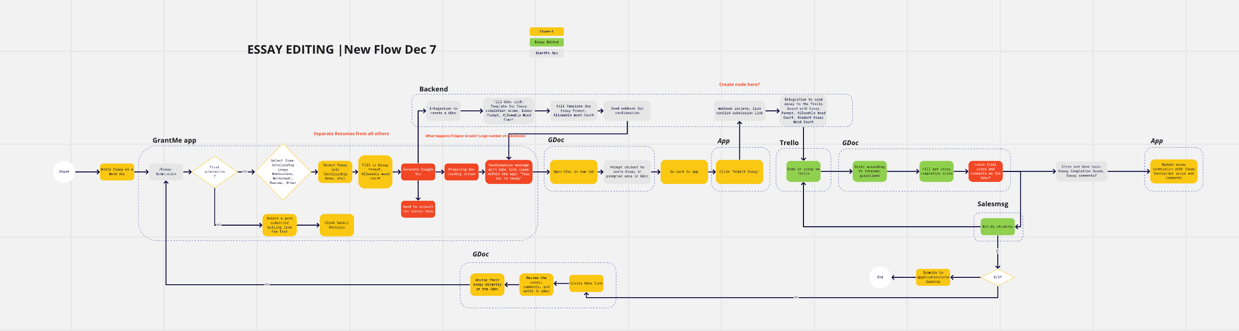
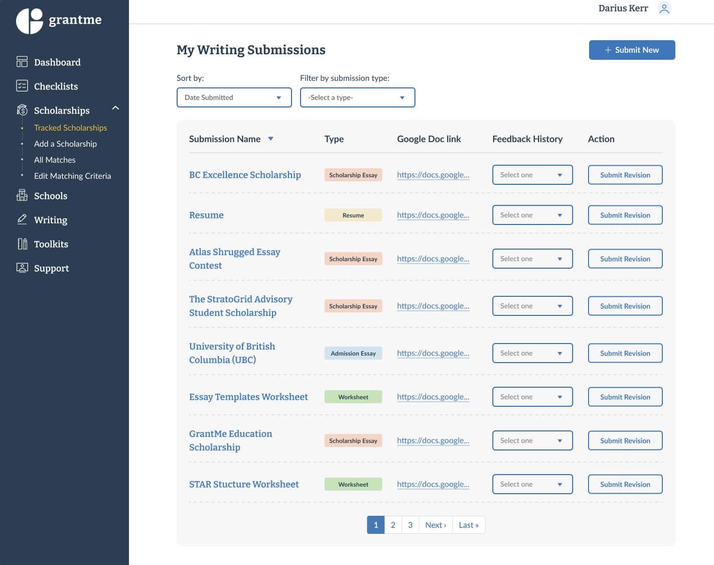
One place to see every essay
The submissions page listed everything a student had sent in, with its type, Doc link and feedback history. A revision started from the essay’s own row, with no new form to fill in.
Higher NPS and no new editors
Students told us they were relieved to finally see which essays they’d submitted and where each one stood. Editors stopped losing review time to Doc permissions.
Keeping Docs and Trello
I mapped the options with Jake and Adam before I designed anything. A native editor would have solved ownership cleanly, but we couldn’t build it by the deadline. So we kept the tools everyone already knew and changed who owned the Docs.
Testing wireframes with five students
On the submit screen, an early visual element pulled attention away from the form, so I moved to a split-screen layout with the form next to the information a student needed to fill it in.
On the submissions page, students coming from the old list of links found the new layout more complex at first. I added tooltips and inline explanations to carry them through the change.
Where the editing still happens
Mapping the constraints with Jake and Adam early is what got us to the ownership fix. If I’d started from the interface, I’d have designed around a native editor we didn’t have time to build.
A student can’t delete an editor’s score anymore, but editing still happens in Google Docs, which was never built for someone reviewing 170 essays in a day. Bringing editing into the platform is the part this project set up and didn’t finish.