 Home

Survey Creator
A survey builder for Customer Ops, who used to set up surveys by editing JSON in Postman.
- Role
- Lead designer
- Timeline
- Five months
- Year
- 2024
- Team
- UX researcher, design system designer
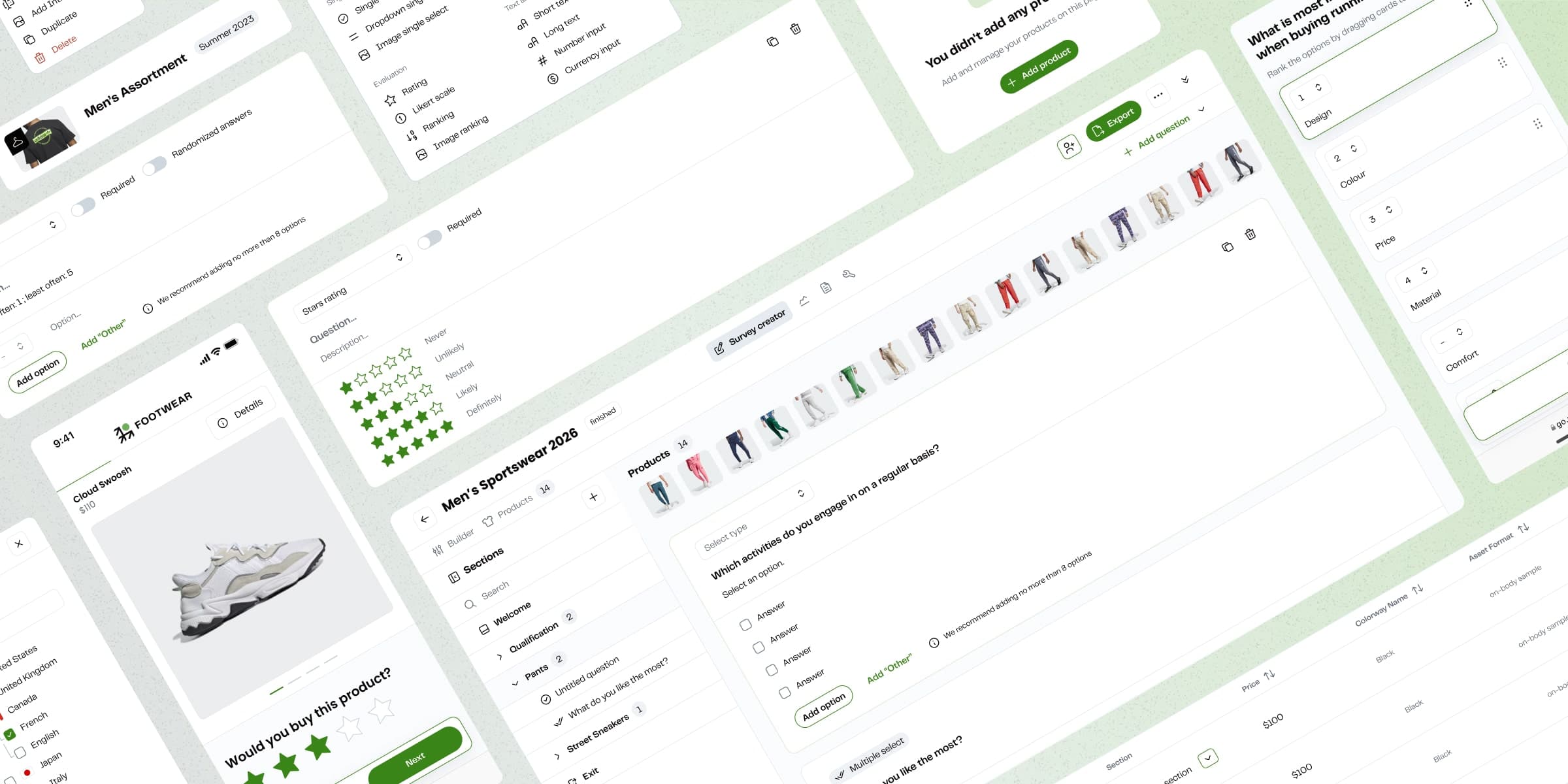
A workflow stuck in JSON and Postman
Survey Creator is the internal tool Customer Ops uses to build and publish surveys before brands see any results. By late 2023, Ops was setting up standard surveys by editing JSON and making API calls in Postman. It took technical knowledge, it took too long, and people kept having to ask for help.
MakerSights wanted to run more research and offer new kinds of it. Neither was possible while setup stayed this manual.
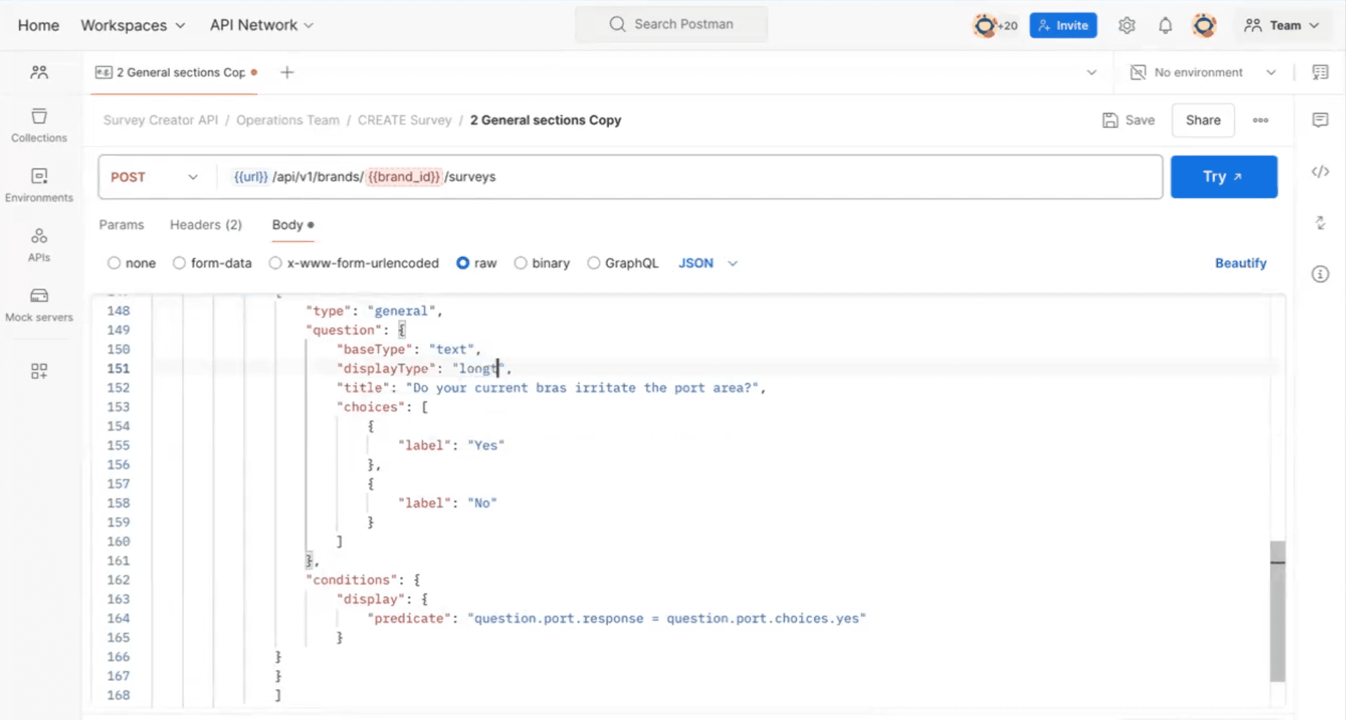
An editor that didn’t match the survey
The 1.0 tool had its own problems. Editing one question took too many clicks and pop-ups, and the editor looked nothing like what survey takers saw. If something looked wrong, Ops found out in a separate preview, then went back and rebuilt it.
75% of enterprise customers also tested across regions, and 1.0 handled international testing and conditional logic badly.
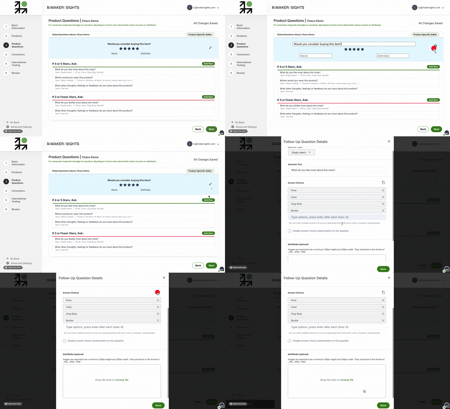
Learning the JSON workflow myself
I led design with Lena, a UX researcher, and Vasyl, a design system designer. I mapped the Ops workflow from defining a survey through to fielding it, interviewed the team, and learned the JSON and Postman setup myself. Some of the clunkiness only made sense to me once I’d tried it.
As the product grew, I also refreshed the Survey Creator components and worked through edge cases with engineering.
Survey Creator 2.0
Seeing the whole survey
A sidebar now shows the full structure: welcome, screener, product sections, consumers and exit. Ops could open a section to see its questions and reorder anything, so they didn’t have to keep the structure in their heads.
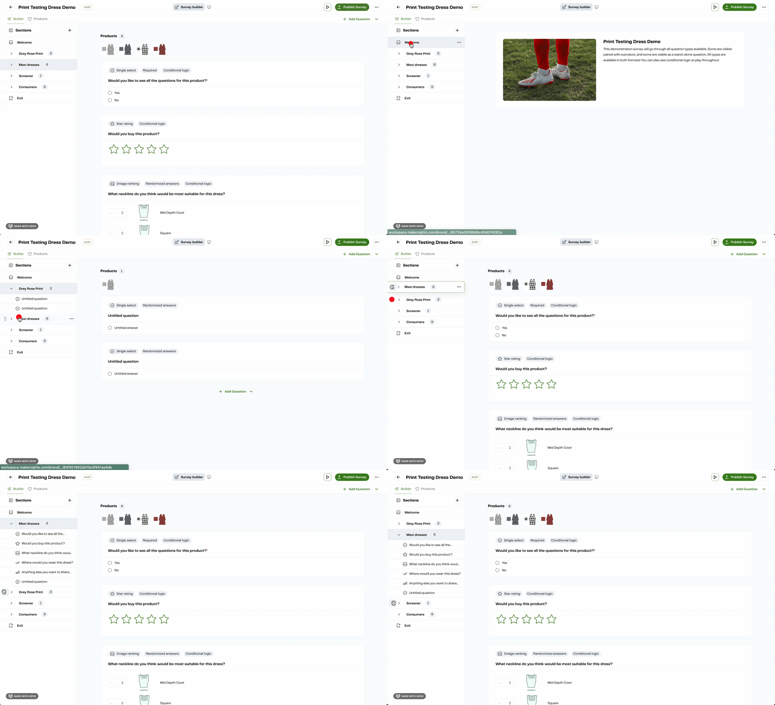
Building in a view that matches the survey
Midway through, I ran a usability test on two versions. A structure-only view was faster to move around in, but people weren’t sure how the survey would look. A view matching what survey takers see was clear, but slower to work in.
We went with a mix: the matching view by default, with inline editing to keep it quick. Ops started catching layout problems during the build, when they were cheap to fix.
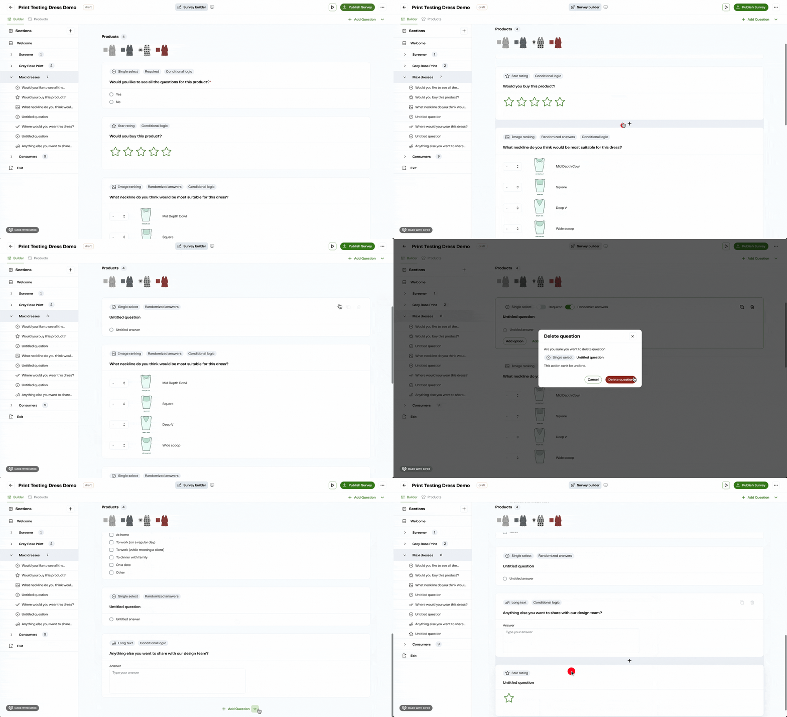
Moving between viewing and editing
In 1.0, switching between viewing and editing added clicks to something Ops did all day. In 2.0 it became a quick change of mode.
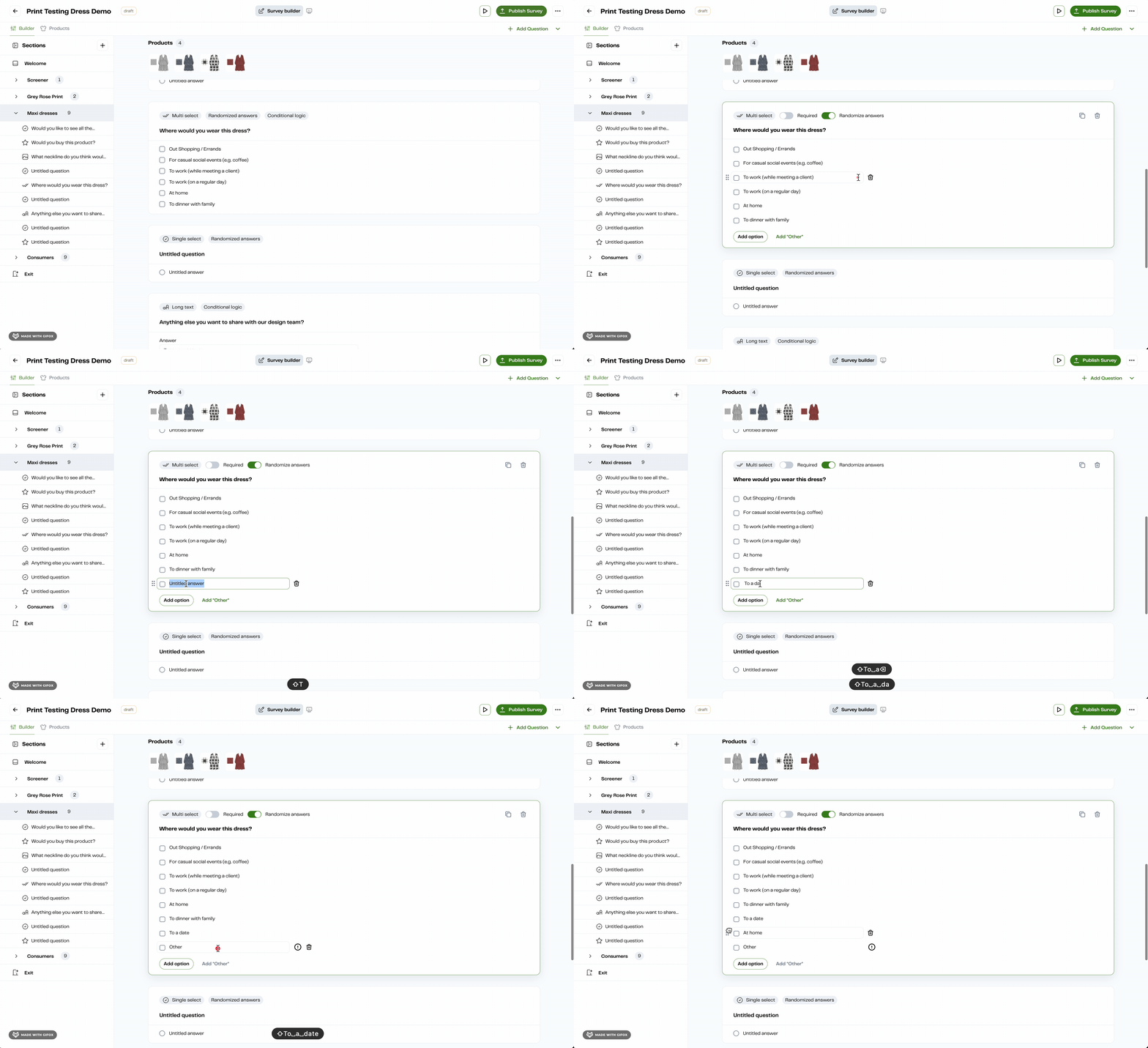
Fewer steps and more projects
JSON went from central to almost gone for Ops, and translation support helped the customers testing across regions. The launch also gave our sales team something to point to with accounts like Adidas and VF Corp going into renewals.
Shipping in small pieces
The roadmap was long and priorities kept shifting, so I kept shipping in small pieces, and each release told us what the next one needed. The habit I’d keep is a small one. I ran impact and effort mapping in FigJam, and after a while engineers and customer success were working through the designs with me.