 Home

Survey Taker 2.0
I joined a stop-start project after a contract designer had shaped the early concepts. My part was the mobile interactions: making them hold up with real products and edge cases, and deciding with the team what we could build.
- Role
- Product designer
- Timeline
- About six months
- Year
- 2022
- Team
- PM, two front-end engineers
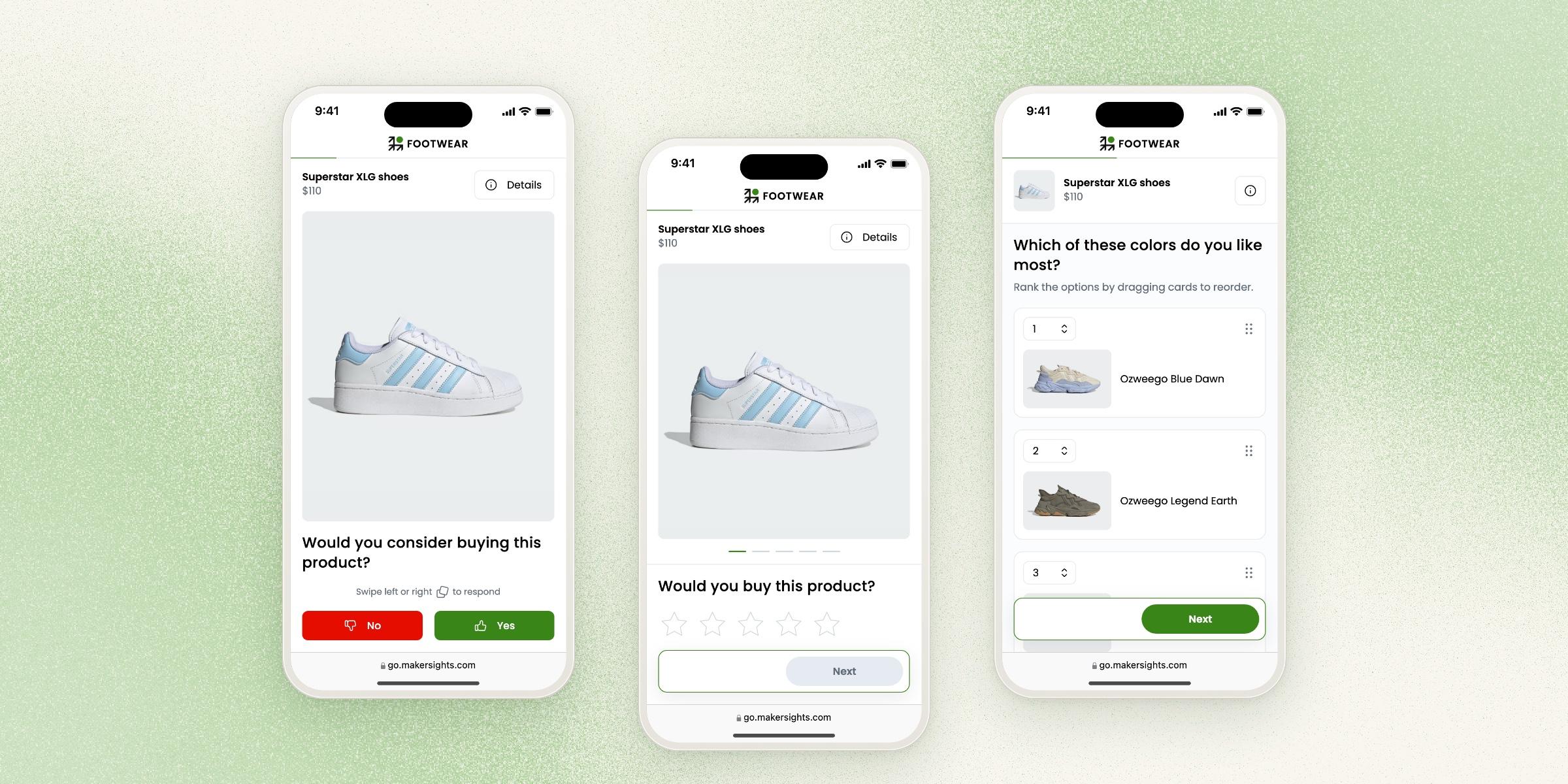
People scrolled back and forth to answer one question
MakerSights helps retail brands decide which products to make, using consumer feedback. Survey Taker is what those consumers see. They came to us through a third-party panel provider, so ours was one of many surveys they took, and every person who dropped off was a response the brand didn’t get.
The old survey was built for desktop. On a phone, the answers took up half the screen and the product information was squeezed in around them. In session recordings, I watched people scroll up to look at the product, scroll down to answer, then scroll up again. They were trying to compare what they saw with what they were asked, and the layout kept the two apart.
Choosing responsive web over an app
We chose responsive web over a native app. Panel respondents would never download an app for one survey, and a link let them start answering right away. The same build also served brand customers and our operations team, who previewed every survey on desktop before it went live. One product covered both audiences.
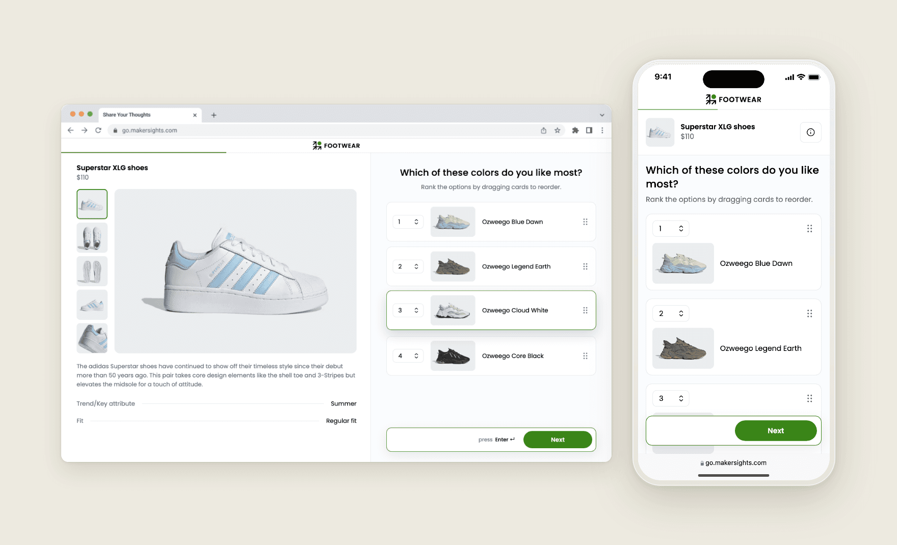
That choice shaped everything after it. Every interaction had to work in a mobile browser, and we had no budget for separate desktop and mobile versions of a question.
Showing the product first, then the question
People are in the survey to react to a product, so I used progressive disclosure to show the product visuals first, large and at the top, with the question right under them. Everything else stayed out of the way until someone wanted it.
One large photo shows at a time, with the other angles a swipe away. On long questions, the photo shrinks to a small product card so the answers get the room, and dragging down brings it back full size. The description and attributes like fit, material and weight sit behind an info icon, in a sheet that leaves the question in place underneath.
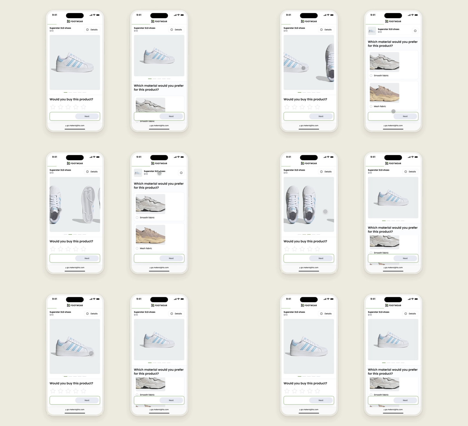
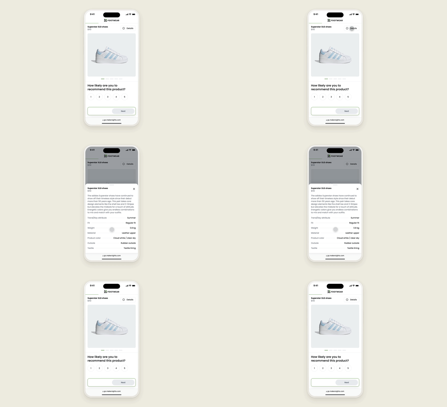
Answering got easier too. Answer options became large cards people could tap anywhere, in place of small radio buttons. The old survey only had multiple choice and open text, so 2.0 added image selection and ranking, and people could answer by reacting to the product.
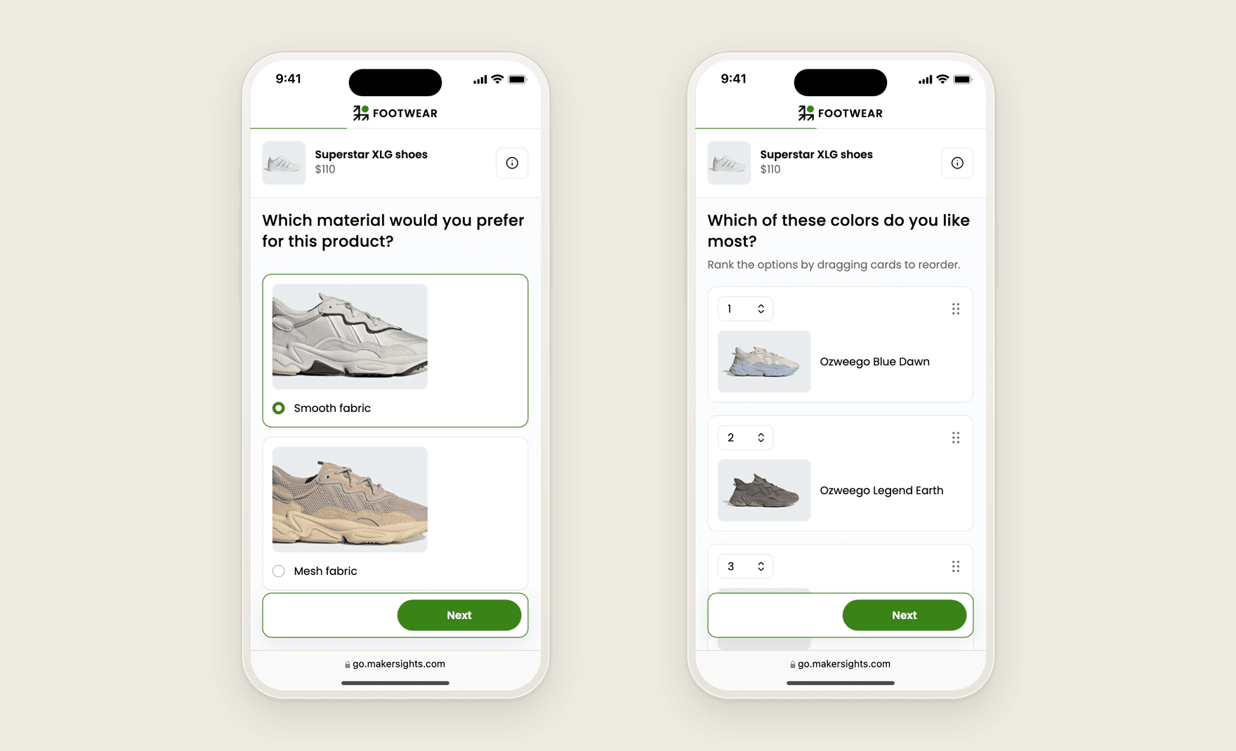
Most of my time went into the cases the early designs hadn’t covered: long product names, products with many photos or none, long answer lists and very small screens.
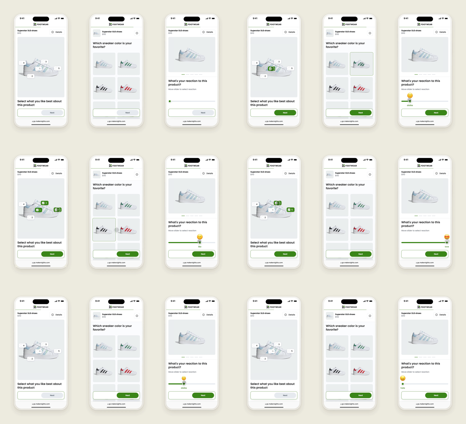
Rebuilding the old question types first
With limited engineering, we rebuilt the essential question types from the old survey first. My manager ran collaborative sessions with customers to find out which question types they needed, and the PM negotiated how many we could take on. Newer types made for quick reactions on a phone, like swiping left or right, had to wait.
The matrix question was where one build hurt most. A grid of statements and a rating scale works on desktop and gets cramped on a phone. A separate mobile layout would have meant building the question twice, so we went with the table. I knew it would be the weakest part of the survey on mobile, and I accepted that so the core question types could ship.
2.0 ran alongside the old survey, so it only reached part of the respondents. After launch, the company moved its focus to parts of the product with more impact, like Survey Results and Survey Creator.
What designing for phones taught me
Survey Taker showed me how much progressive disclosure matters on a phone. Every piece of information competes for the same small screen, so deciding what waits behind a swipe or a tap shaped the whole survey.
I also learned a lot about mobile practice I hadn’t needed on desktop: what a thumb can reach, how big a tap target needs to be, and how people scroll and tap differently on a phone.