

Inspire and Reward Individuals to Take Actions for Their Health, Community, and the Planet.
Monashee Health Collective is a chiropractor, physiotherapist, and RMT office in Vernon, Okanagan. It prides itself to be Okanagan valley’s most passionate community of health and wellness professionals. Steven Piper, the business owner, is seeking to build a wellness app that helps the wellness community in Vernon to create positive impact on their health, the community, and the environment.
In this project, the second UI Designer (Seol-Ah) and I work very closely as a team. Therefore I will be using a lot of "we" to describe our collaborations.
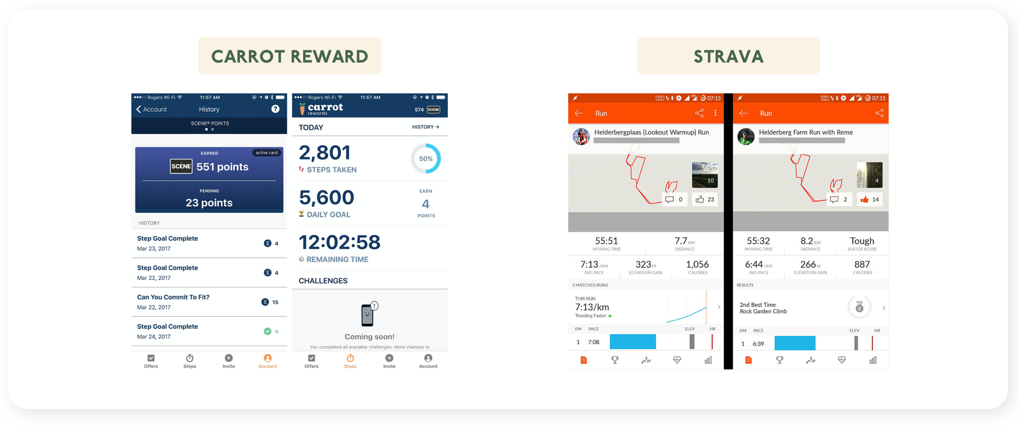
After having the initial kick-off meeting with our client, I got some insights into a few app visuals that our client referred to.
Both Carrot Rewards and Strava have a simple UI style that consist of friendly typeface, minimal colour palette and consistent iconography. For the Rewards system, I also drew inspirations from Starbucks app with their star icons.
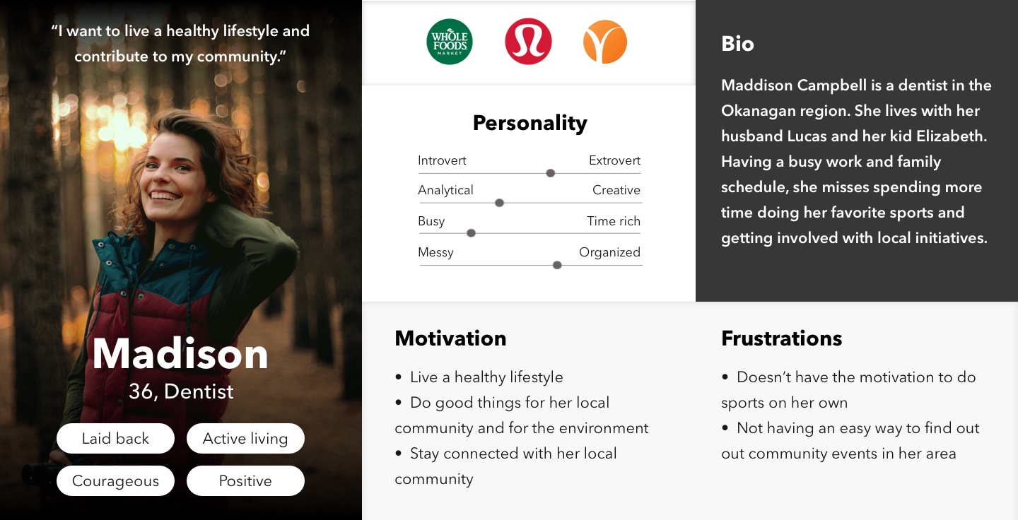
Our target audience is mainly female of 35–55 years old in Vernon who’s into health and wellness. The UX team worked on the persona's content that represents the app’s typical user while I put them together into a nice visual.
During the initial client kick-off meeting, I asked questions such as "If your brand were to be a car, what would it be?" and "What word associations would you use to describe your brand?" to get a sense of the brand's visual, voice, personality.
From then we created a Gut Test which consisted of 20 UI/visual slides to have a better understanding of our client's likes and dislikes.
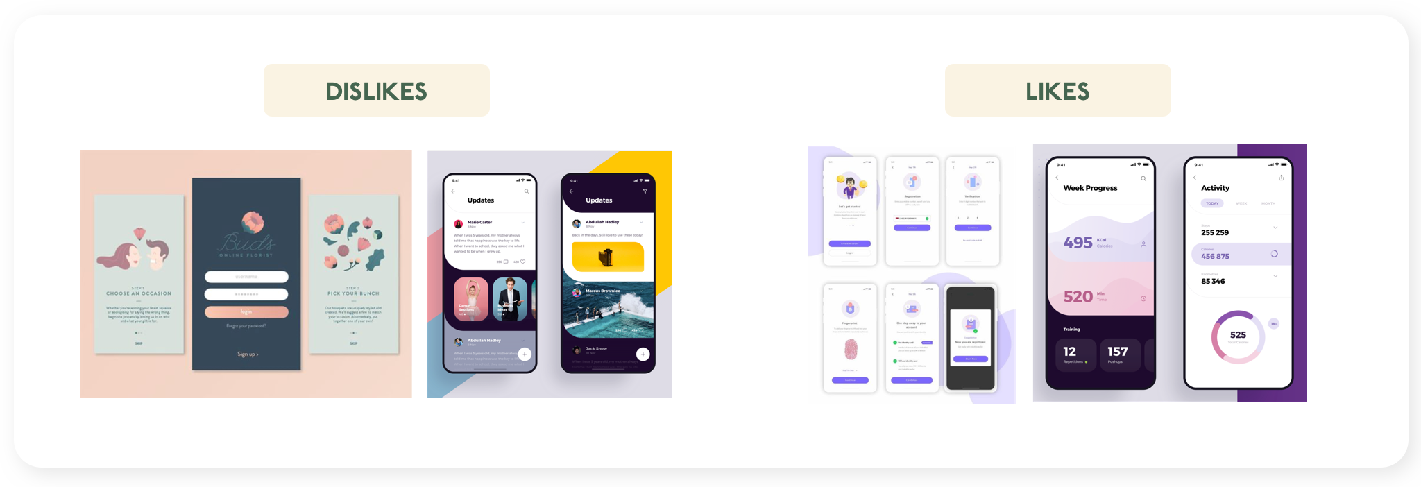
Dislikes:
Likes:
We were in a search for the 'Why' that would inspire all of our users to use the app. We worked with our client and landed on this Why below:
To inspire change that positively impacts health, community, and the environment.
Based on the Why above, we came up with two design directions. One is a calmer mood which Seol Ah worked on, and one is brighter and happier in mood that I worked on.
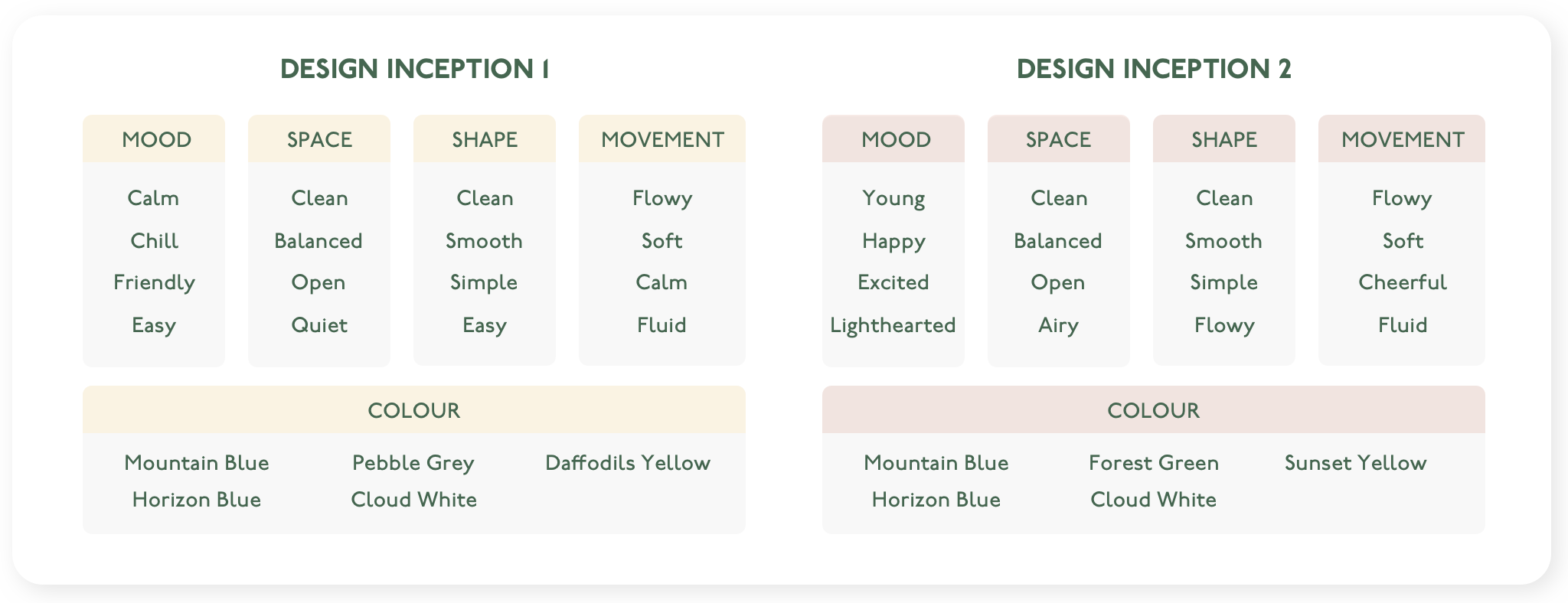
The two moodboards are Self Care and Happy Together which gave a visual sense and vibe of the two visual directions above.
Self care: calm, chill, easy
Happy together: happy, bright, light-hearted
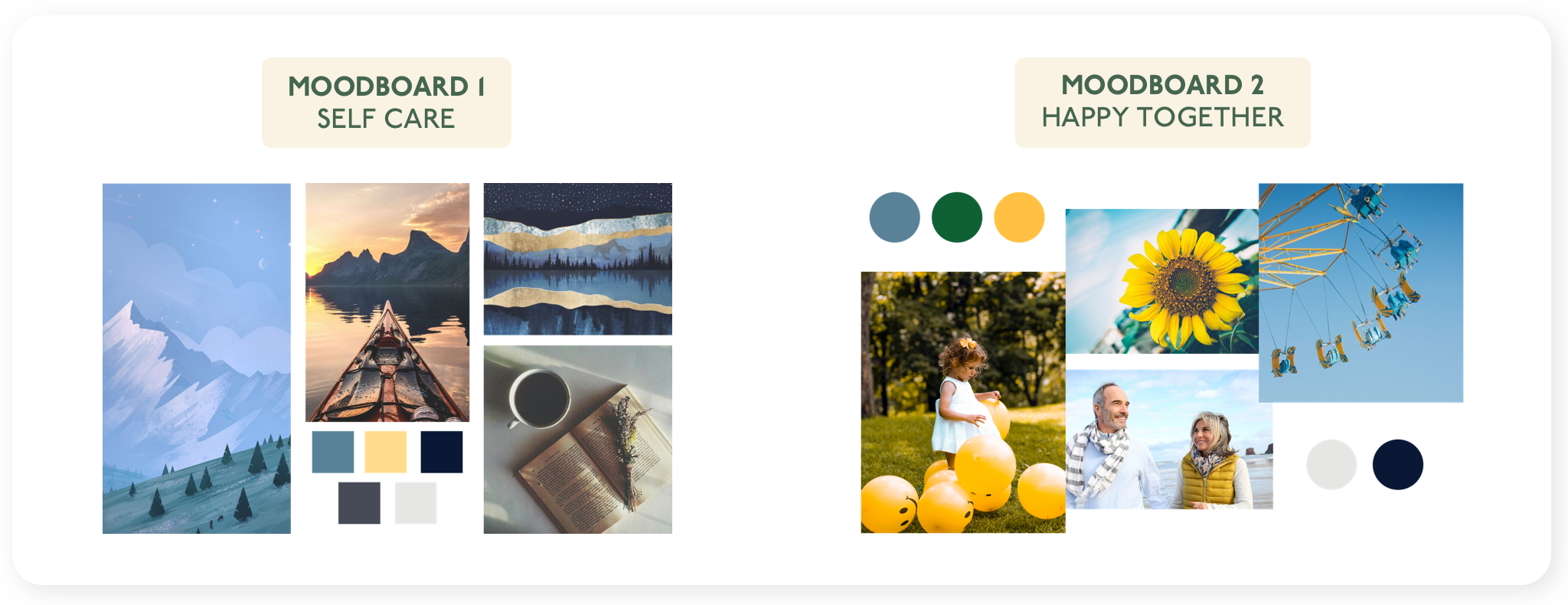
If I were to re-do these moodboards, I would incorporate more design elements such as sample typography, illustrations, shapes to give a closer sense to the aspired visual styles.
We presented two style tiles for the two directions for our client to pick, along with the design inceptions and moodboards.
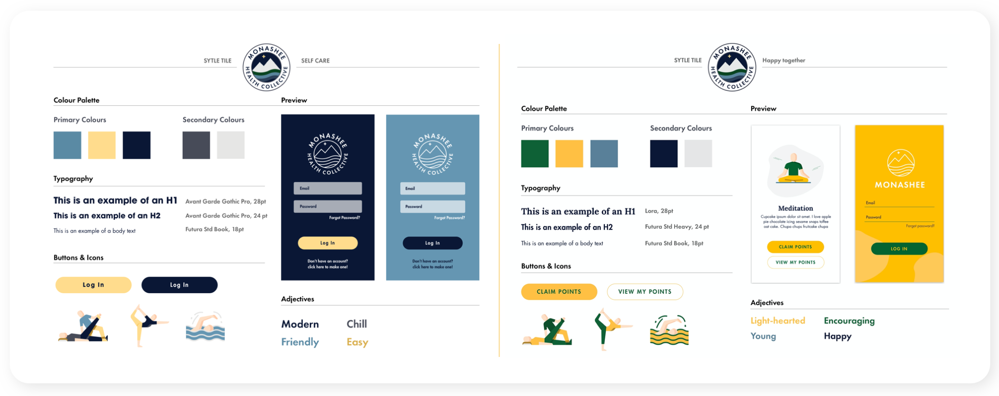
Our client liked certain elements on both style tiles and wanted the branding to stay closer to the company's mother brand. Therefore we landed on a final direction that merged the two style tiles.
Typography: We chose Avant Garde Gothic Pro for the entire design, as it’s a strong yet friendly typeface that catches attention.
Iconography: The icon style is illustrative of the activities and are playful.
Buttons: We created them clean with fully rounded corners, for a clean and friendly look.
I went through a roller coaster in logo creation. Being unclear of client's preference for the app name and logo (which was failure from our communications), I went around many different sketches in different directions. We strived to incorporate certain elements from the current business logo, such as the mountain shape to represent wellness and Monashee, and the plus sign to represent health. We explored different logo design that plays with the theme of wellness (with the leaves), mountains (with M shape), and C that stands for Collective.
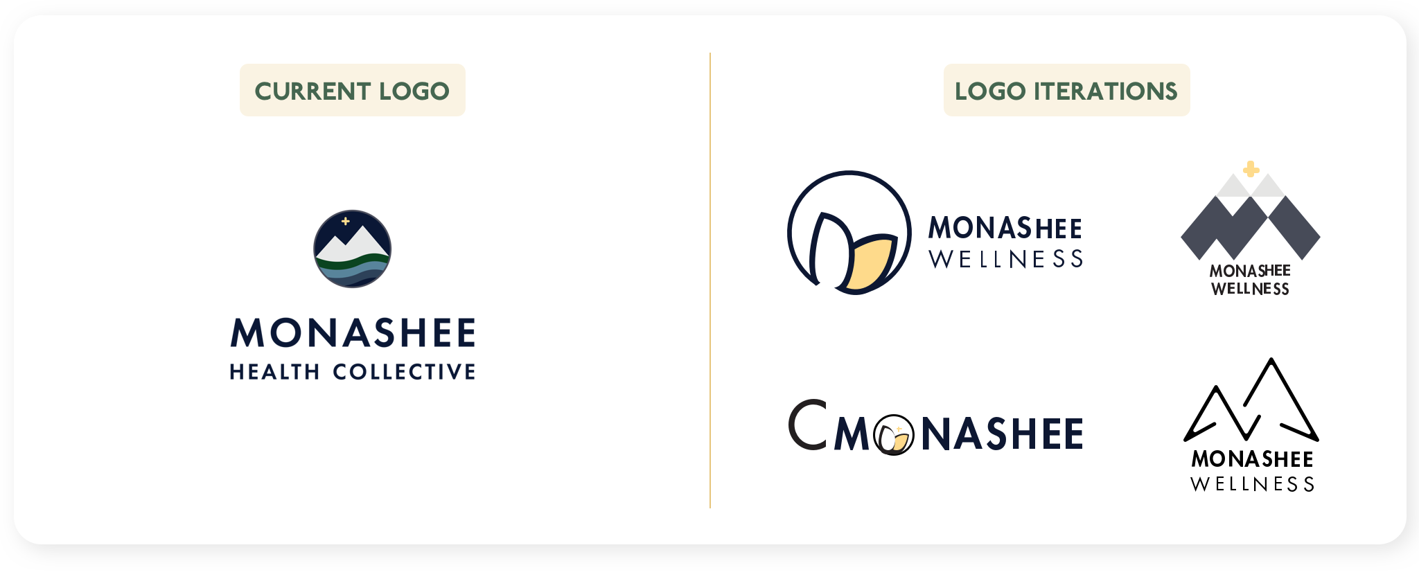
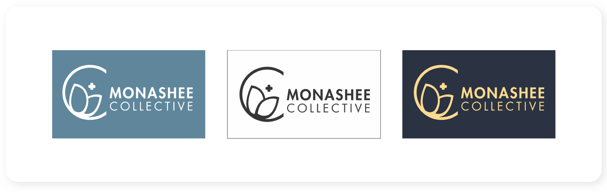
After showing the variations to our client and confirming the preferred app name, we finally got a logo that we’re happy about!
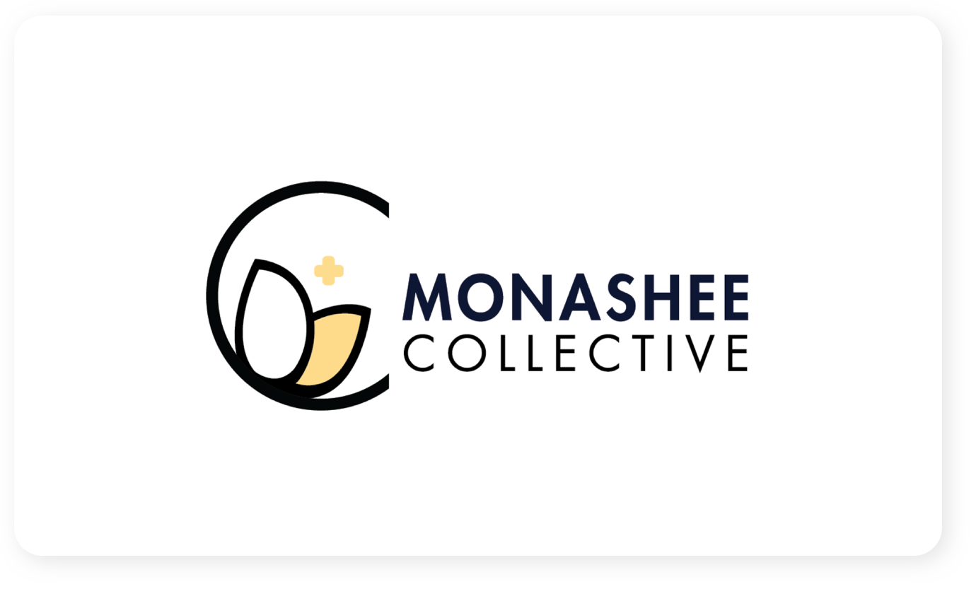
This logo incorporates the C that stands for Collective, leaves that represents wellness/holistic living, and plus sign for health. The name Monashee Collective is to differentiate with the mother brand and to emphasize on the idea of ‘collective’. Below are some logo variations with different colours and backgrounds.
Here is a UI Style Guide that translated the brand into visual elements in the product. One of my proudest achievements on this project is the iconography creation from scratch.
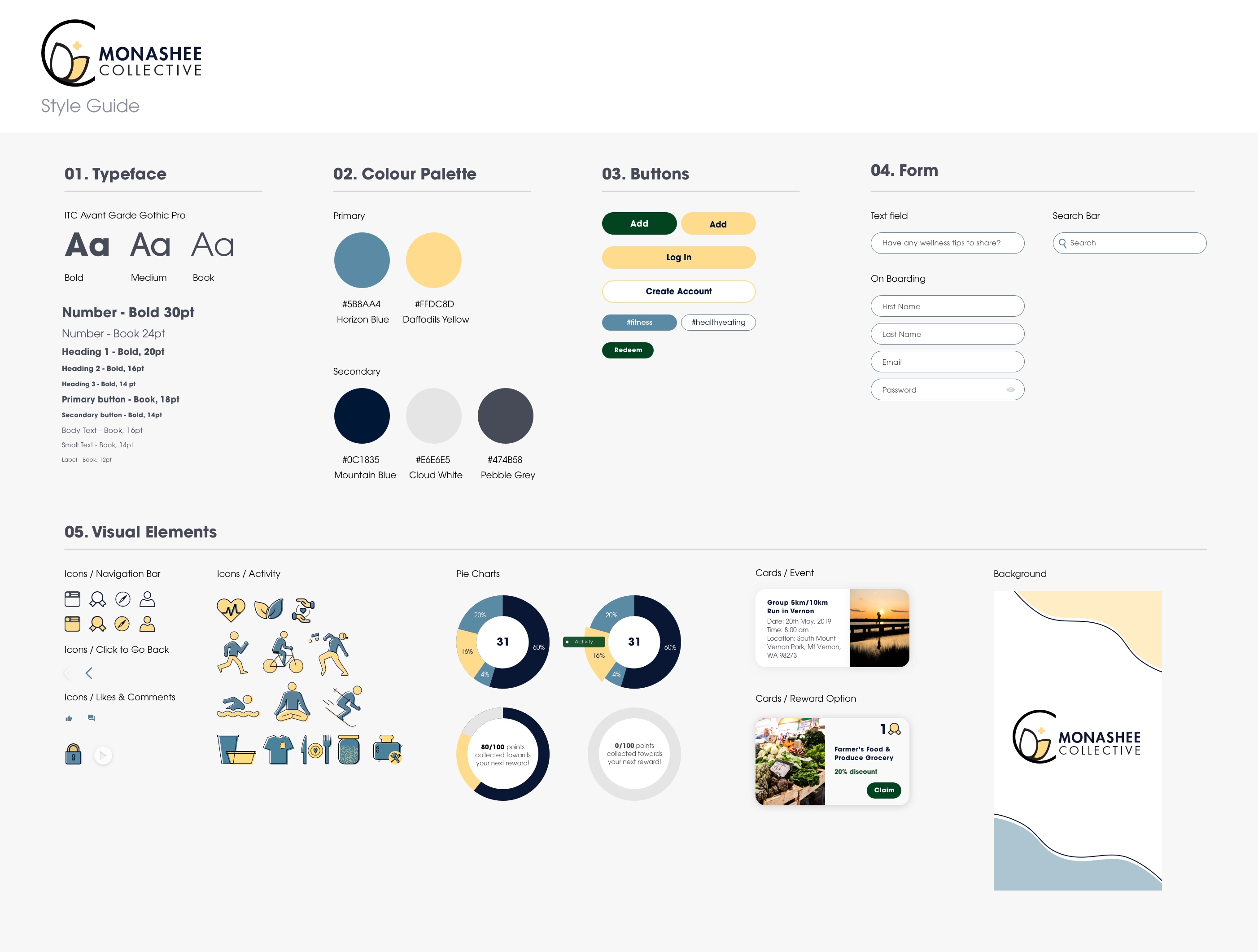

Icons creation: It was a great learning experience for me in creating iconography for the project. Creating icons that replicate human bodies was harder than other types and I’m very glad to work on them.
Team goals/expectations: I learnt that it’s important to set team goals and expectations from the beginning for the team to work towards. Without these, there were discrepancies in individual effort and work quality, hence creating some frustrations and team frictions.
Time boxing/Project management: Although having a scrum master, we did not agree on firm milestone deadlines. As a result, some milestones on both UI and UX sides were delayed and the last week was quite hectic. I learnt to set up the timeline with firm deadlines and have the scrum master to remind the team to follow it through.
Team collaboration: Since UI and UX are so closely related, it’s very hard to not think about the UX side and try to not get involved in it. I since then have learnt to offer the right amount of help, trusting and empowering my team to do our best work together.
Senior Product Designer with a business and marketing background—driving vision through validated insights, fast collaboration, and problem-solving that blends strategy with craft.
