Connecting Temporary Workers with Employers Instantly.
Have you ever been between jobs and got stressed out looking at your bank account going down? Would you Google ‘temp work near me’ or go look at Craigslist postings to find something? I bet it’s been hard for you to navigate through temp job opportunities in your area.
As millennials are looking for a more flexible lifestyle to pursue their passions/interests rather than working the typical 9–5, the gig economy is growing bigger and bigger. People are seeking efficient ways to earn extra cash in their free time without having to go through the hassle of a temp agency or having to deal with unverified employers on Craigslist.
The opportunity here lies in a digital platform that helps connect temp job seekers and businesses in a way that’s quick, convenient, and secured. WorkBriefly is born!
According to Statistics Canada, Canada’s staffing and recruiting industry group represents about 13.6% of the country’s workforce. Deloitte’s latest millennial study (2019) found that 64 percent of full-time workers want to do “side hustles” to make extra money. There has been a shift towards a gig/sharing economy with people seeking a level of autonomy such as deciding when they want to work. This is reflective of the rise in platform-based models such as Uber, Lyft, and Airbnb. However, the staffing and temporary work placement industry has yet to make great progress to innovate and adapt to the changing times.
With millennials comprising the largest portion of today’s workforce, the timing is well suited for an innovative platform that can help connect this generation of temporary job seekers with businesses that require their help.
There are existing apps for temp work such as Wonolo, Syft, Hyred, and Tempo. The features that the industry is lacking are:
I was involved in crafting the survey questions to find out about our users' motivations, behaviours, and frustrations. We collected 30 survey respondents via our Google Form survey. There were valuable insights that validated our hypotheses:

The survey results gave a direction to the features that are desirable to our users.
I crafted the questions with my team and conducted interviews on both workers and businesses. Some quotes that stuck out from the user interviews pointed out the pain points users are experiencing:
The 25 days of nothing between the interviews, getting informally hired, going to formal training and doing training trips are too long.
Please help ensure workers of any capacity are given protection and rights. Sometimes gigs get cancelled.
It takes weeks for me to receive payment.
There’s an opportunity to speed up the hiring process and protect the workers. A process that’s straightforward, fast, and clear is what the users need in this market.
There are two user types for this app: job seekers and businesses. After discussing with our client about the project time constraint, we got a go ahead to focus on designing solutions for job seekers.
Having a persona was crucial to help represent our target users and make sure that our design decisions are based on our user needs. Jen and I worked on developing the persona together, focusing on users motivations, pain points, and needs based on our research insights.

We put ourselves into Chase’s shoes and visualize a scenario where Chase would be using the WorkBriefly app. What are the context, reason, and motivation for Chase to use WorkBriefly?
Chase is checking his bank account, it’s running low because he hasn’t gotten paid yet from the last film he did. It’s still 8 days away til his pay day! He’s getting stressed out with upcoming bills that he needs to deal with.
Chase is wondering how he can earn some quick money between now and his acting gig in a couple of weeks. Chase would like to find a temp job in the meantime that he doesn’t have to go out of his way to get to. Time and convenience are of essence for Chase here.
He signs up for WorkBriefly to look for gigs, and instantly gets a few gigs lined up. Now he can happily go hang out with friends and doesn’t have to worry about not having cash flow for the next while!
After completing the first gig through Workbriefly and got paid quickly, Chase is excited to look for more gigs on the platform.
We created a user flow in order to map out Chase's tasks and interactions on the WorkBriefly app.

Get on-boarded on the app > Browse for jobs and apply for jobs > Wait on job application decision > Get approved for the job > Clock-in/out for the job > Rate employer > Gets paid for the job done.
To make it enticing for Chase before he has to invest much time in signing up, I suggested that Chase should be able skip the sign-up/on-boarding steps to first preview the available gigs on the app. This helps Chase to get excited about potential gigs before having to go through the sign-up/on-boarding process.
Based on the research, persona creation, and user flow, I worked with the team to define the Not Needed, Must Have, and Nice to Have Features for WorkBriefly.
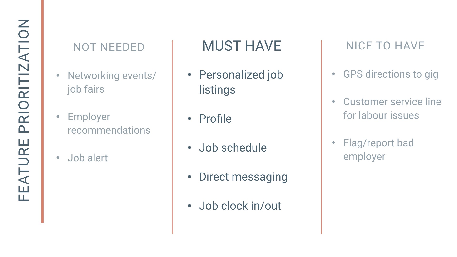
Our team decided to go with the features below, as our app would fill the gap in the market, and differentiate us from the competitions.
We started our design phase by creating paper prototypes. This allowed us to iterate quickly after testing, before moving into digitizing the wireframes. We utilized the ‘design studio’ method to work on some main screens together and split the rest of the screens.
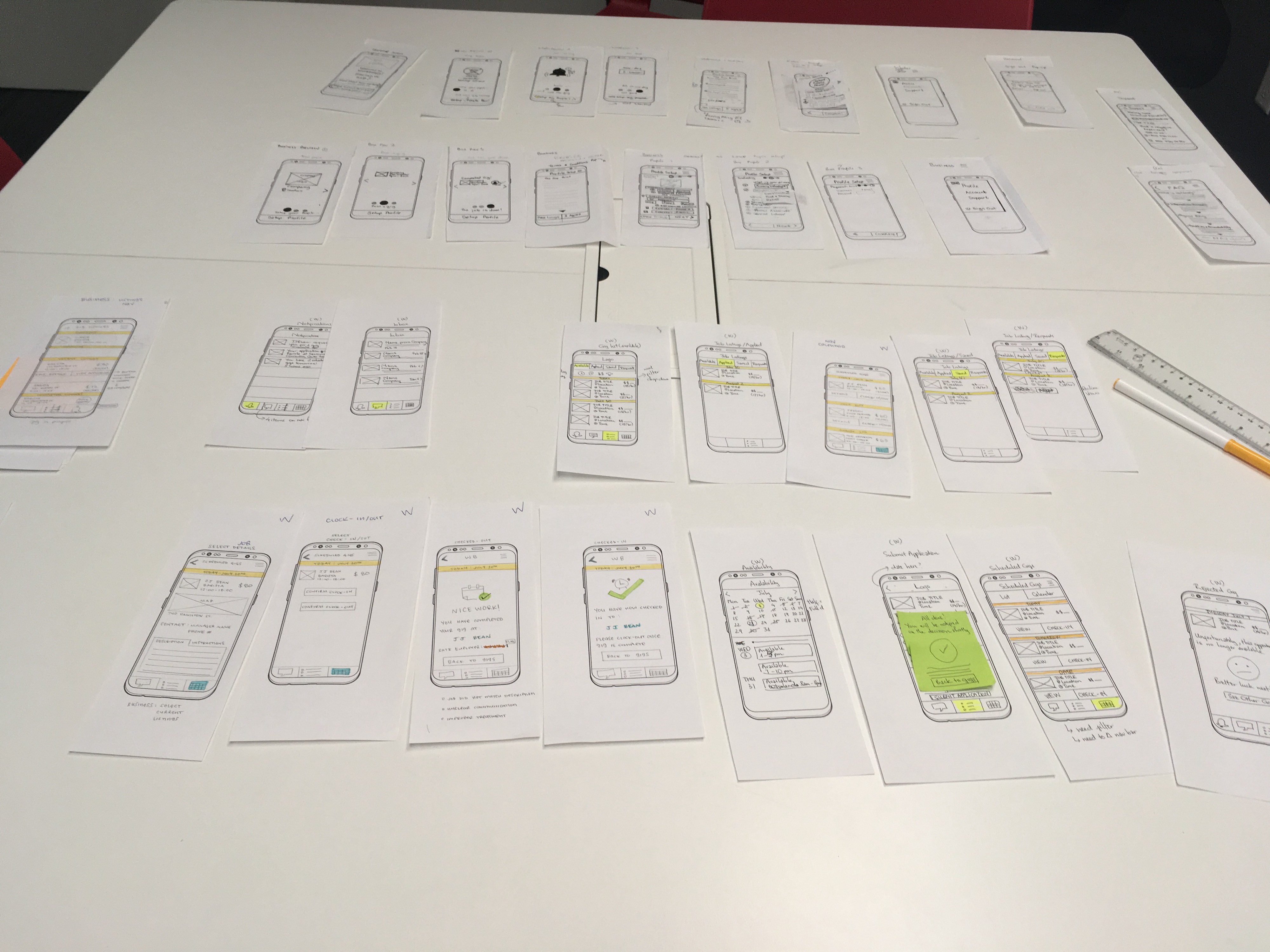
After testing with a few people on both paper and mid-fi prototypes, our team had a few key iterations.
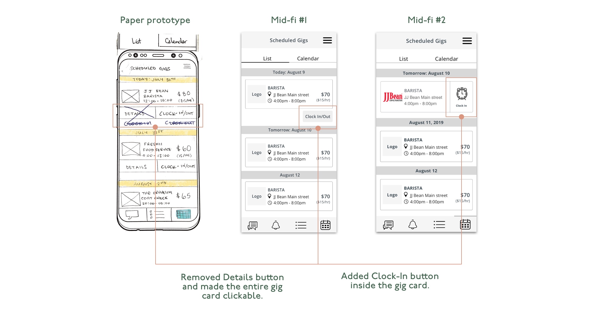
We referred back to our research and found that to help our users achieve their goals fast, we need to cut down on screens while ensuring clear visual communications.
Initially, we had the Clock In/Out button outside of the job listing card, but we decided to make it simpler by adding the button straight into the card and using an icon to make it quicker to glance at. We simplified the step by just having the "Clock In" feature here, as the user doesn't need to think about clocking out at this point.
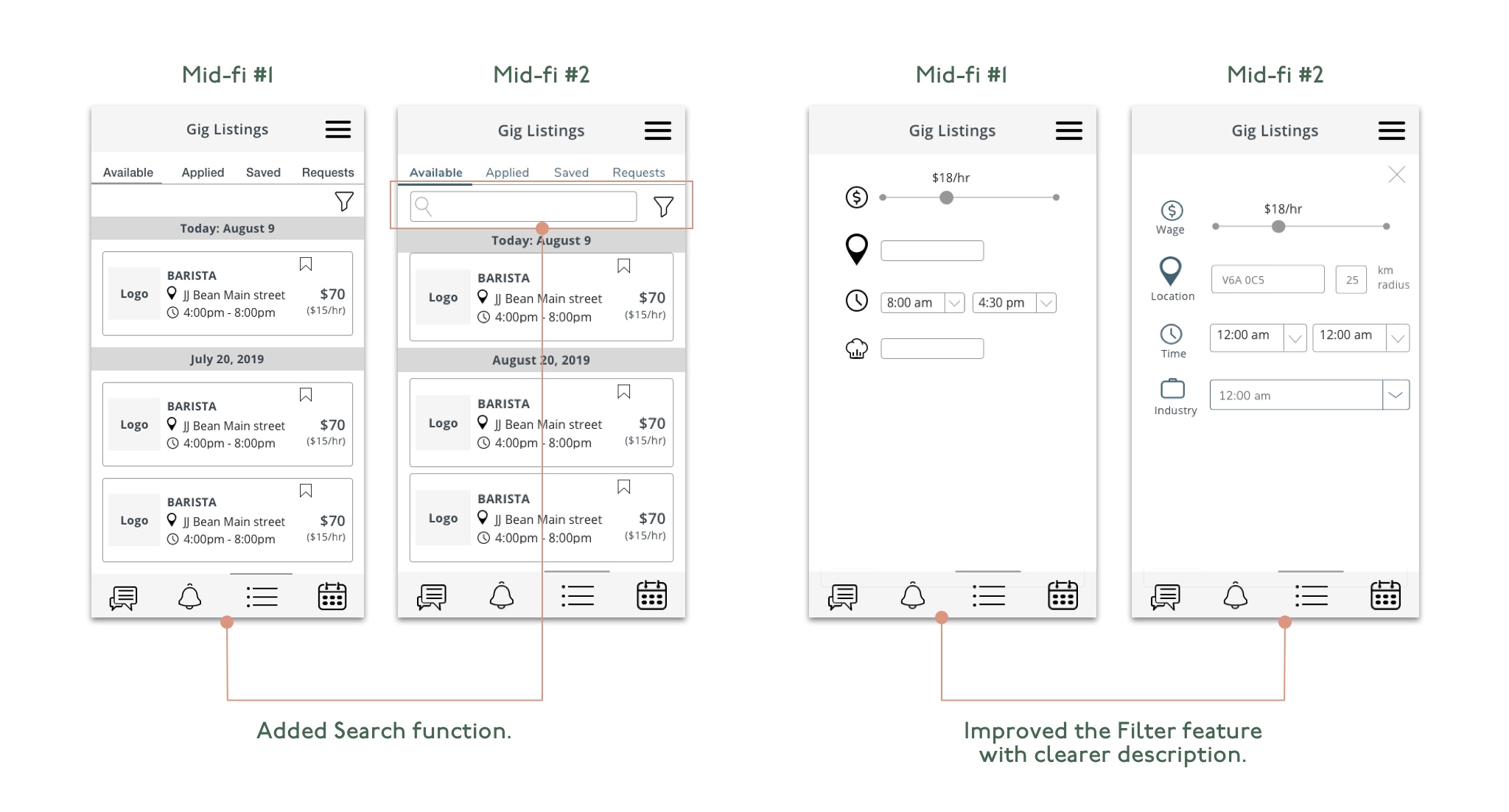
I realized that our filters are unclear, and being able to find a gig with proximity is important for our users. So I added titles under each icon and added km radius for location.
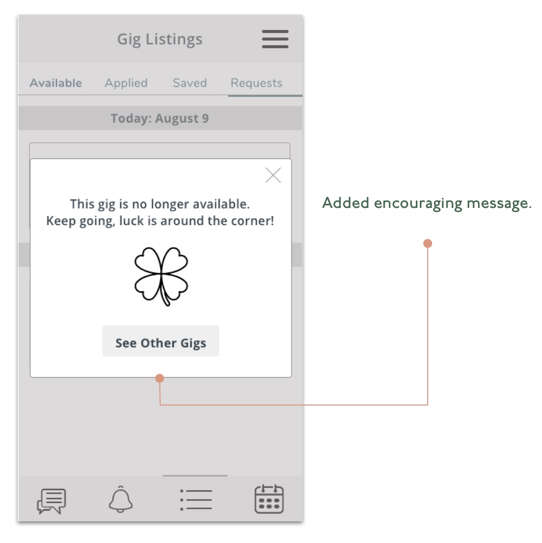
Our research showed job searchers' frustrations of the long and daunting process. We strive to bring a more delightful experience to the users, by adding encouraging and positive messages throughout the app.
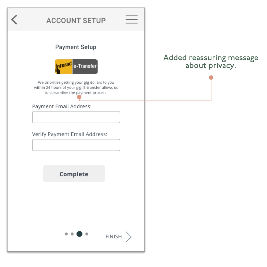
We are collecting various data such as address and payment info, which is private information. Providing clear messages to explain why we collected those data would be necessary to help assure our users about their information privacy.
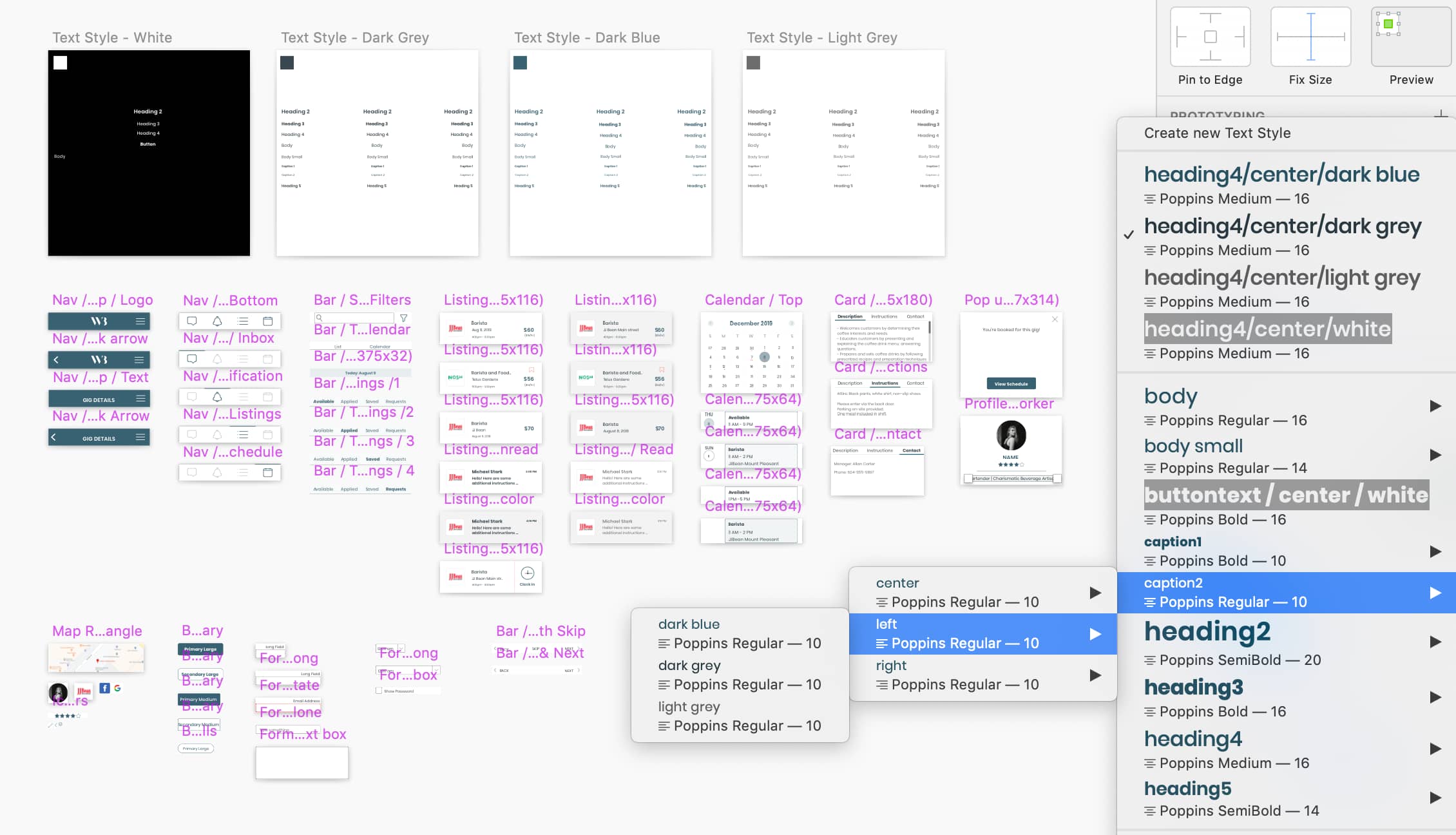
As an organized person, streamlining our design components has been one of my favourite things to do! I created a design system for our project on Sketch since the mid-fidelity wireframing phase, and streamlining it further more in the high-fidelity phase.
Our client was very happy with the thorough design process our team went through and the final product. We have achieved the business goal of creating a product that's filling a gap in a market, and fulfilled the user goal of being able to find temp work efficiently.
Due to the 3-week time constraint, we were unable to design and build the prototype for our business users. To have a fully functioning MVP, I’d complete the prototype for business users, with the following features that are unique to them:
Senior Product Designer with a business and marketing background—driving vision through validated insights, fast collaboration, and problem-solving that blends strategy with craft.