GrantMe helps students get into scholarship and admissions programs, and essay coaching is the core of that service. At peak deadlines, editors were reviewing up to 170 essays a day, and the review process ran across three separate tools: students submitted a Google Doc link through a form, Zapier and Trello routed the submission to an editor, and feedback came back as comments in the Doc plus a follow-up text.
None of that was broken exactly. It was slow to run at scale, and every handoff depended on someone remembering a manual step: filling out the same form again, granting Doc access, checking a Trello board for status.
A UX audit laid out the mechanics: students re-filled the same form for every new essay, editors chased down Doc permissions before they could start a review, and neither side had a shared record of what had actually happened.
Interviews with students surfaced the cost of that. One told me all they had to track submissions was a list of Google Doc links, so they couldn't tell what they'd already sent in. Another had gotten a lower score after an editor's comments came back inconsistent with an earlier essay. I hadn't worked on the essay editing side before, so I sat down separately with the editor leads to hear their half: students often forgot to grant Doc access, which stalled a review before it started, and students would sometimes delete an editor's scores and comments directly in the Doc.
Both sides were pointing at the same root cause from opposite ends. The only record of a submission and its feedback lived inside a Doc the student controlled, and a Doc a student can edit is not a system of record.

Three goals: bring turnaround time and service cost down enough to handle peak volume without adding headcount, give students and editors a shared record of what had been submitted and reviewed, and do it without asking either side to learn a system built from scratch.
I led the design process end to end: the UX audit, the interviews with students and editor leads, the wireframes, and the usability testing that shaped what shipped. Patrik Lau, our junior designer, was on the project with me. Jake Guy was our PM and Adam Griffiths was lead engineer.
Once the audit and interviews made the pattern clear, I worked with Jake and Adam to map what was feasible under our deadline. That's where the core decision came from: own the Doc directly. If GrantMe held it instead of the student, an editor's access and a student's score couldn't depend on the student sharing a link or leaving a comment alone.
I tested early wireframes with five students. On the submission screen, an early visual element was pulling attention away from the task, so I replaced it with a split-screen layout that put the form next to the information a student needed. On the essay management page, students got confused switching over from the old list-of-links view, so I added tooltips and inline explanations to carry them through the change.
Coming soon.
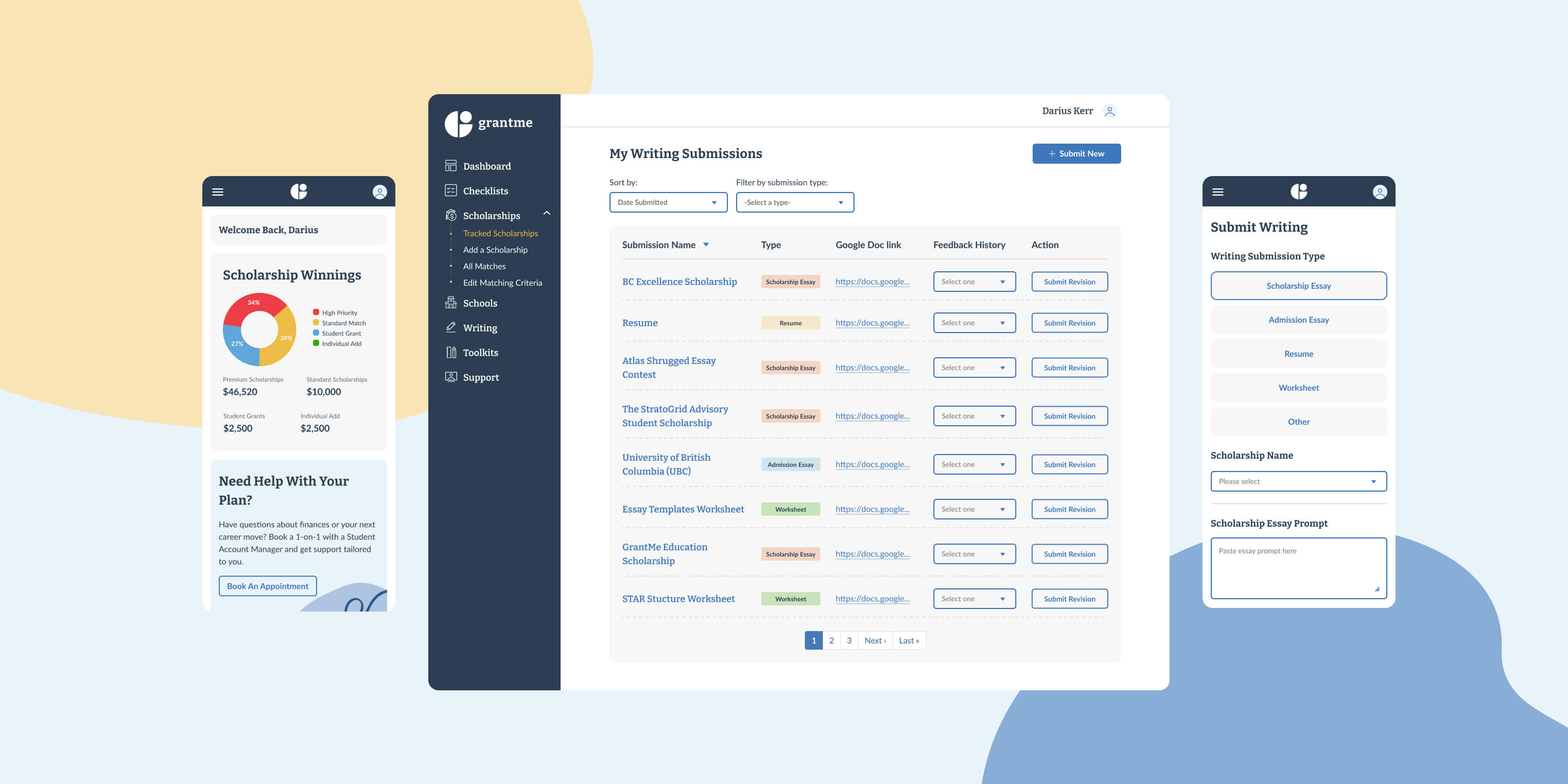
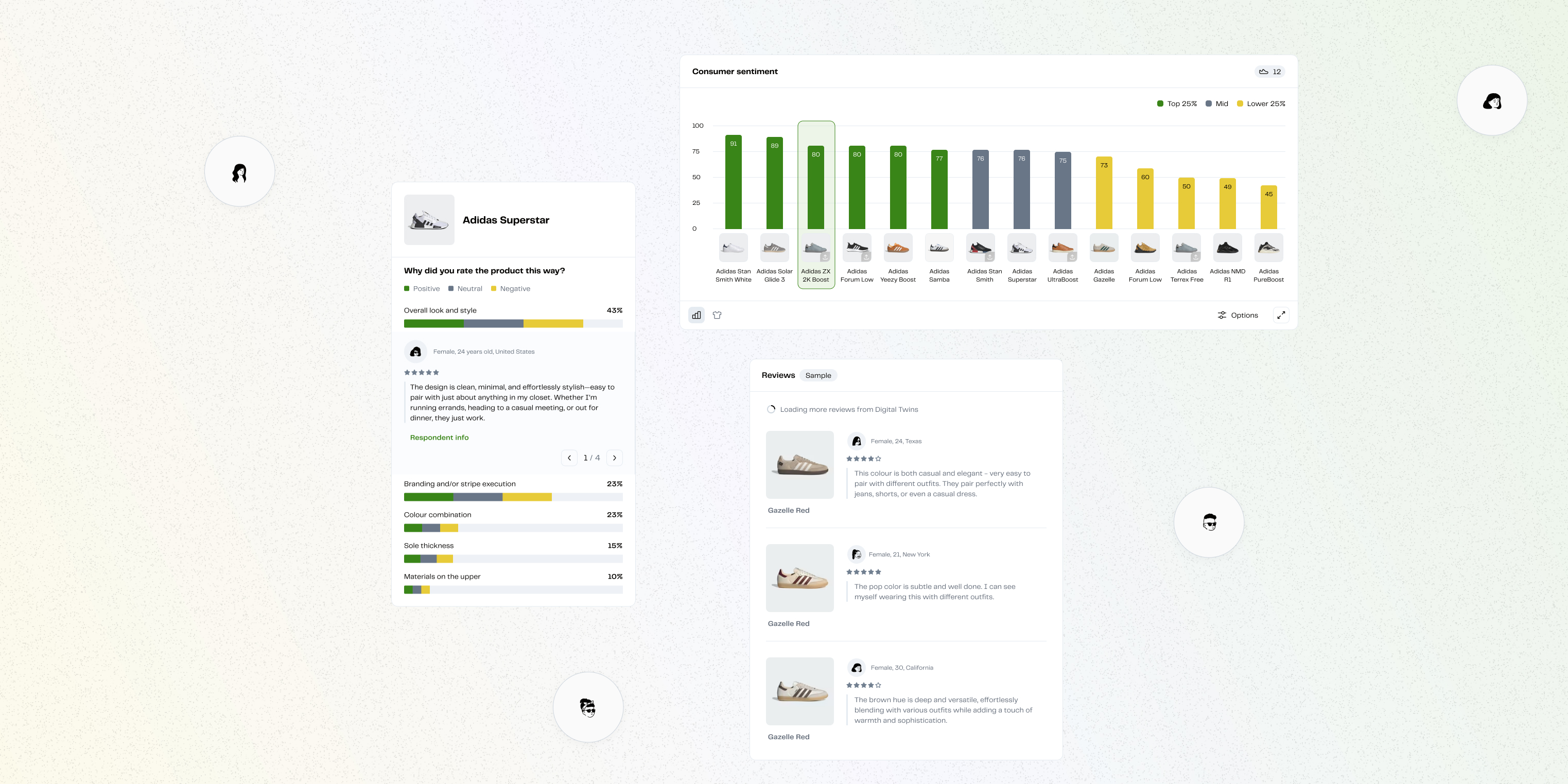
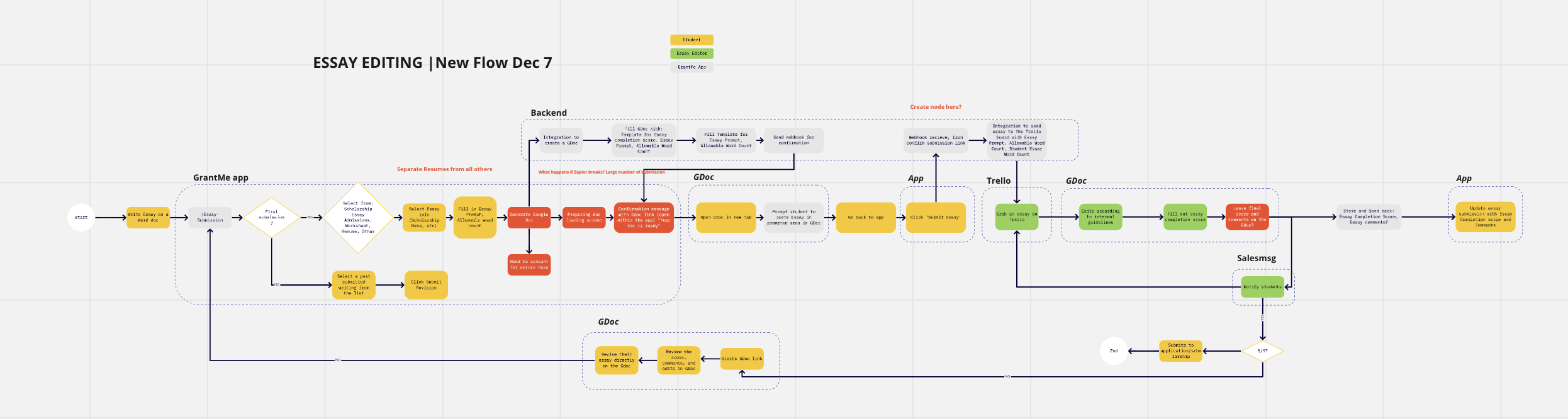
The fix wasn't a rebuild. Students still wrote in Google Docs, editors still worked out of Trello. GrantMe took ownership of the layer in between instead: the company held the Docs directly so editor access no longer depended on the student, and a Zapier integration synced Trello and Drupal so scores and comments showed up inside the app, where a student couldn't touch them.
Keeping Docs, Trello, and Zapier in place meant less new surface to design and build against a deadline that didn't move. It also meant trading one kind of debt for another: the system of record moved out of the student's hands, but essay editing itself was still happening inside a tool GrantMe didn't fully control.
Students were coming to the system during stressful, high-stakes periods. Instead of adding visual delight that distracted from the task, I prioritized layouts and interactions that kept the submission process clear, direct, and focused on the essay itself.
Because students were used to the old system, the new workflows initially felt unfamiliar. I added tooltips, inline explanations, and contextual guidance to ease the learning curve—helping users feel confident without needing external support.
Sitting down with Jake and Adam to map technical constraints before I designed anything is what got us to the ownership fix instead of a workaround. If I'd started from the interface, I'd have designed around a native essay editor we didn't have the timeline to build, and the actual problem, who the record belonged to, would have gone unsolved.
The part I'd still change: a student can't delete an editor's score anymore, but the writing and editing experience is still borrowed from Google Docs, a tool that was never built for someone reviewing 170 essays in a day. Bringing essay editing natively into the platform is the fix this project set up but didn't finish.
Senior Product Designer with a business and marketing background. Driving vision through validated insights, fast collaboration, and prototyping with care.


.png)