MakerSights helps retail brands make faster product decisions using consumer data. The Survey Creator is the tool internal Customer Operations uses to build, configure, and publish surveys before brands ever see a result.
By late 2023, it was a bottleneck. Ops was relying on JSON editing and Postman API calls just to set up a standard survey. The process required technical knowledge, took too long, and was a source of constant stress. Enterprise clients needed more complex, flexible survey structures. The tool couldn't keep up.
The Survey Creator in our 1.0 product was too rigid to scale with evolving needs, limiting our ability to support new research capabilities and use cases. To get work done, internal teams had developed a patchwork of unintuitive workarounds, while end-users faced clunky interactions with too many clicks and poor previews that didn’t match the respondent experience.
This lack of flexibility and usability not only slowed teams down, it also impacted our ability to win new business and risked customer churn—eroding confidence in our platform as a modern research partner.

During the migration from our legacy 1.0 platform to the new 2.0 infrastructure, internal teams were caught in a limbo. To build surveys, they had to rely on JSON files for API access—a process that was error-prone, time-consuming, and morale-draining.
Mistakes often forced users to rebuild entire surveys from scratch, wasting valuable time and limiting our ability to scale adoption of 2.0 surveys effectively.

I was the lead designer on a team of three: Lena (UX researcher) and Vasyl (design system designer).
Problem mapping & ideation: I mapped the full Ops workflow end to end, ran user interviews, and learned how to use the JSON and Postman setup myself. That last part changed what I understood about the problem.
Validation: I ran a usability test mid-project that shaped one of the key design decisions: WYSIWYG versus non-WYSIWYG. The test showed users needed WYSIWYG clarity but the view alone created friction. The hybrid came out of that tension: WYSIWYG as default with fast inline editing and a view/edit toggle.
Design system ownership: As the project scaled, I refreshed Survey Creator components, refined interaction patterns with engineering, and made sure edge cases were handled in design rather than deferred to implementation.
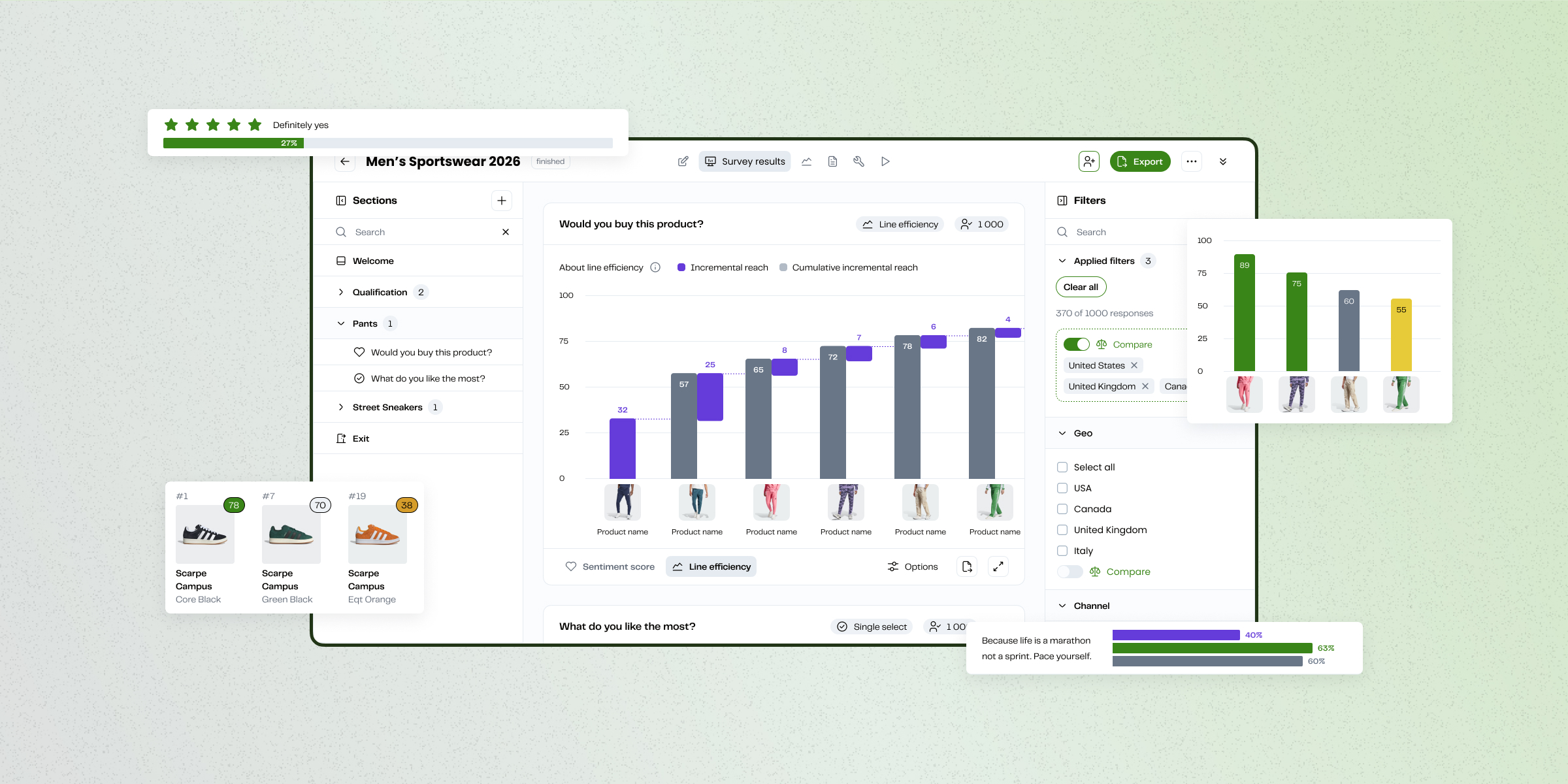
In 1.0, survey structures were rigid and hard to manage—reordering questions or creating logical flows required too many clicks and workarounds. With 2.0, we redesigned the navigation to make the survey structure clear and flexible. Users can now easily view and reorder questions or sections, and create distinct screener, product, and general sections to support different survey flows.
This not only streamlined survey creation but also empowered teams to handle more complex use cases without added friction.

Previously, building surveys required editing JSON files—an error-prone and intimidating process that slowed teams down and often led to mistakes. In 2.0, we introduced a WYSIWYG survey editor that mirrors the respondent experience. This made survey creation more intuitive, eliminated the need for manual JSON editing, and gave users confidence that what they designed is exactly what participants would see.
By reducing complexity and aligning the editor with the end experience, we empowered internal teams to move faster and reduced wasted time caused by rebuilds.

In 1.0, switching between viewing and editing a survey was clunky, adding unnecessary clicks and slowing teams down. With 2.0, we streamlined the flow so that toggling between view and edit modes feels seamless. This reduced friction in day-to-day editing and gave users more confidence when making quick updates.
By simplifying a frequent interaction, we improved not just efficiency, but also the overall sense of fluidity in the platform experience.

This project had a long roadmap and shifting priorities. By designing iteratively and shipping quickly, I learned how to turn ambiguity into progress, continually uncovering user needs while keeping pace with a scrappy startup mindset.
Rather than overhauling processes, I focused on building small, repeatable habits that made collaboration easier. I facilitated workshops in FigJam, guiding our cross-functional team through impact–effort mapping. Soon, engineers and customer success were co-creating alongside design—finding alignment and excitement in the work together. It was a small but meaningful win, and a reminder that progress often comes from simple habits that bring people together.
This project showed me that the most effective design decisions are often the ones that remove friction and unlock capacity. By replacing JSON files with a WYSIWYG editor and simplifying everyday interactions, we not only made surveys easier to build, but also freed teams to focus on higher-value work.
Senior Product Designer with a business and marketing background. Driving vision through validated insights, fast collaboration, and prototyping with care.


.png)