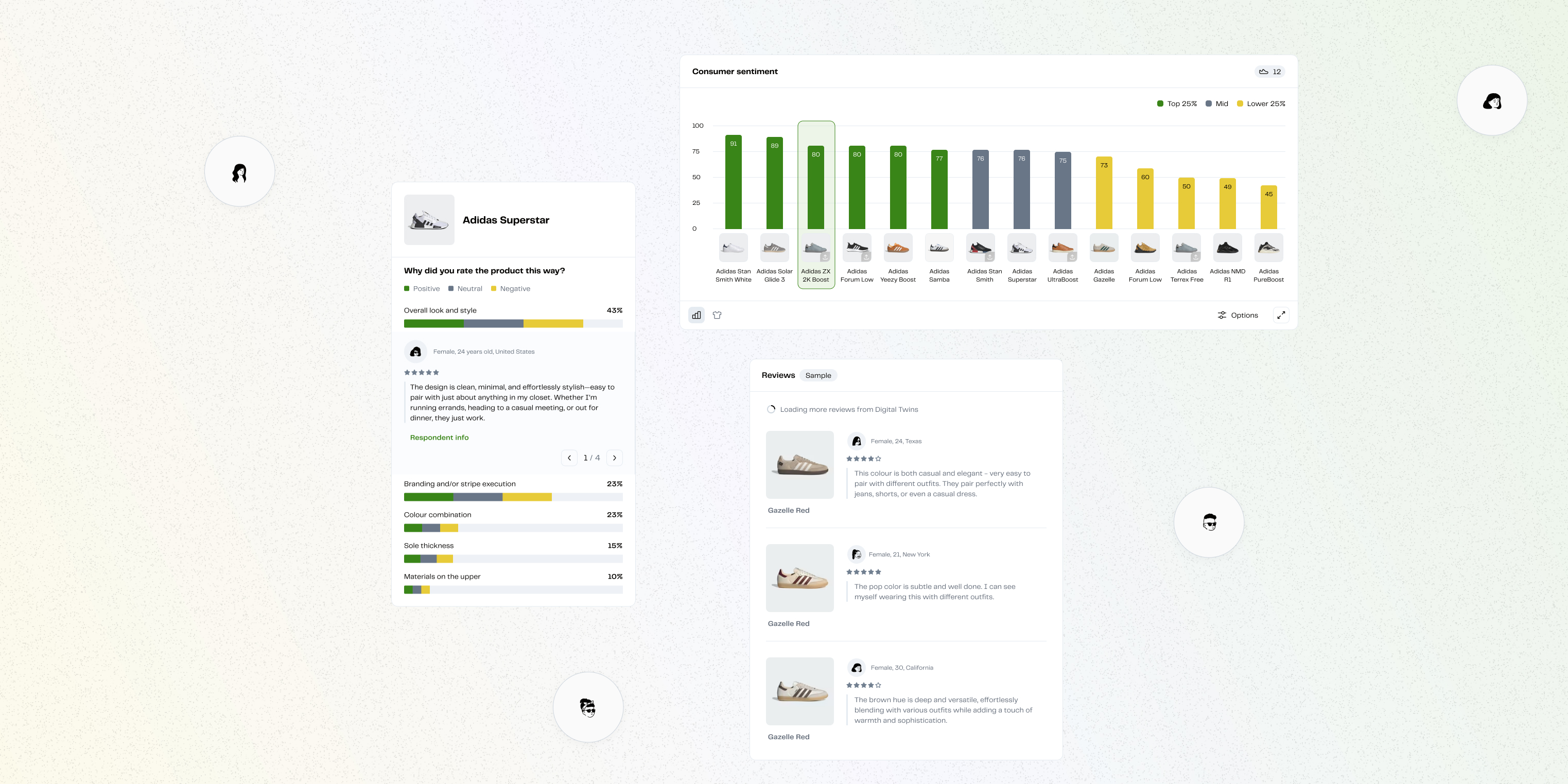
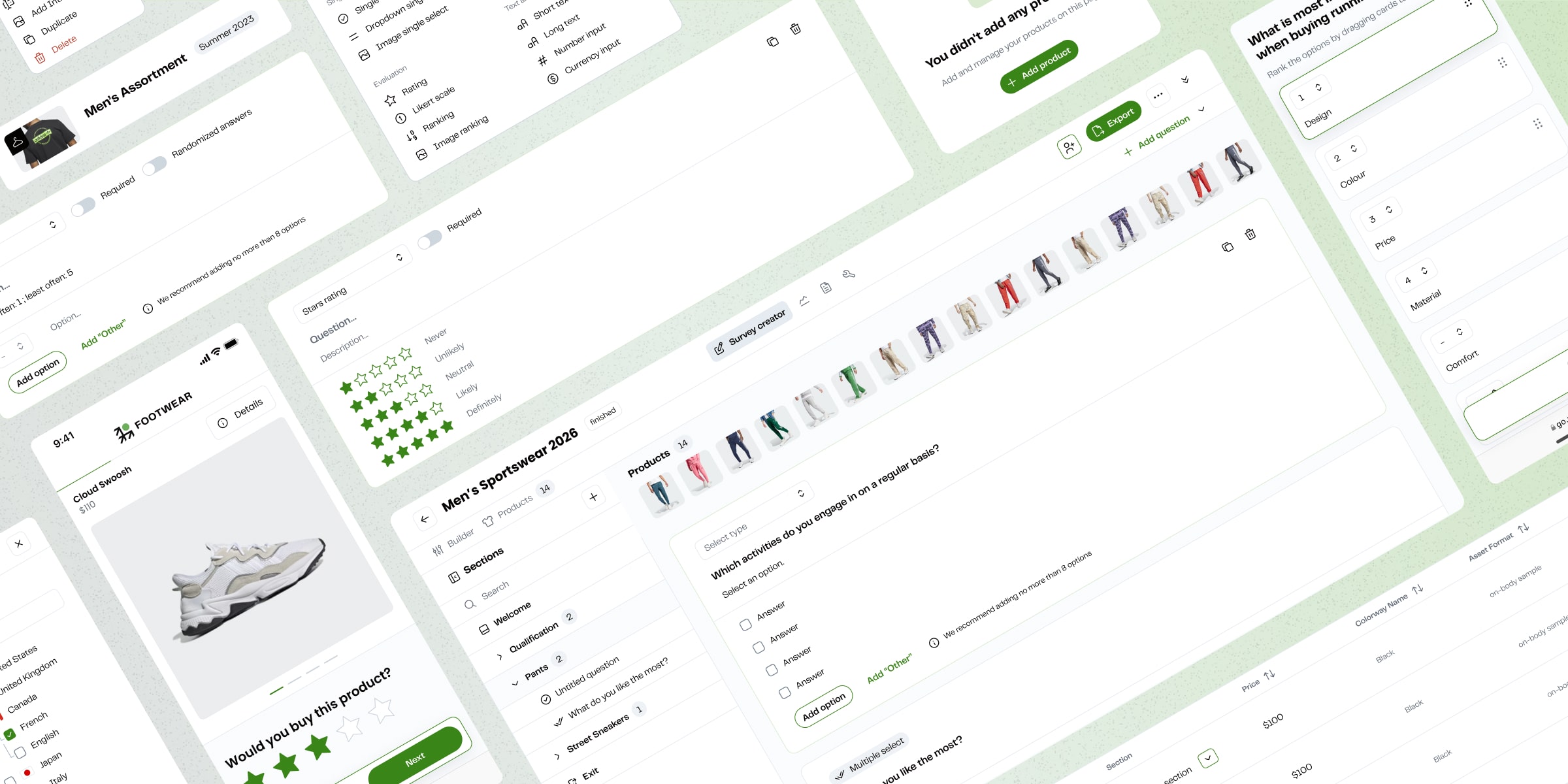
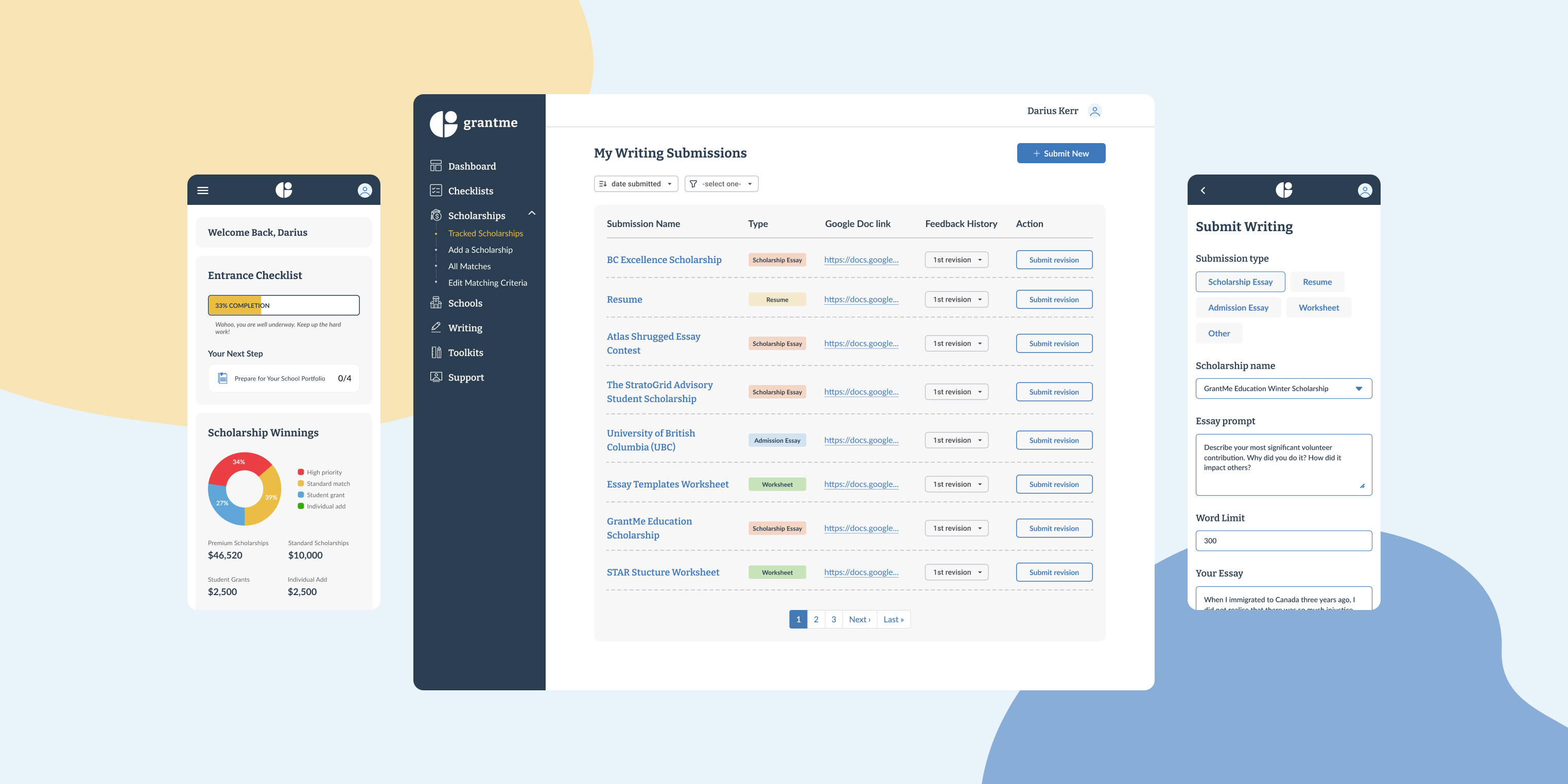
As a modern research partner, MakerSights’ consumer insights drive success for retail brands like Adidas, HOKA, Ralph Lauren, North Face, and Timberland.
Cut inefficiencies so teams could focus on high-value analysis, transition customers fully from 1.0 to 2.0, and lay the foundation for future capabilities — AI-powered analysis, advanced reporting, deeper enterprise features.
The MakerSights Customer Ops team was bottlenecked by a clunky internal workflow. Analysis that should take minutes was taking hours. Data was exported as raw CSVs and formatted manually before it could be shared with any brand.
Brand Insights Managers needed research insights to travel upstream and actually get acted on. What they got instead was a platform where navigation competed with the data, filters were hard to use, and results weren't presented in a way that matched how decisions were made.
Brand Merchants needed clear, actionable data to make product calls. What they had was too much visual noise and not enough time to make sense of it before the decision window closed.

In 1.0, side navigation and filters dominated the screen, leaving less space for data. To help users quickly reach survey insights, we needed to restructure the results, separate insights from raw responses, and upgrade data visualization options.

Analysis often meant downloading CSVs, building pivot tables in Excel, and manually creating charts. This added 4–8 hours of work per project, draining time and keep our team away from higher value work.

The unifying problem: the product had the right data. Getting to it took too long and required too much manual effort. That gap was costing MakerSights time, credibility, and renewal confidence with enterprise clients.
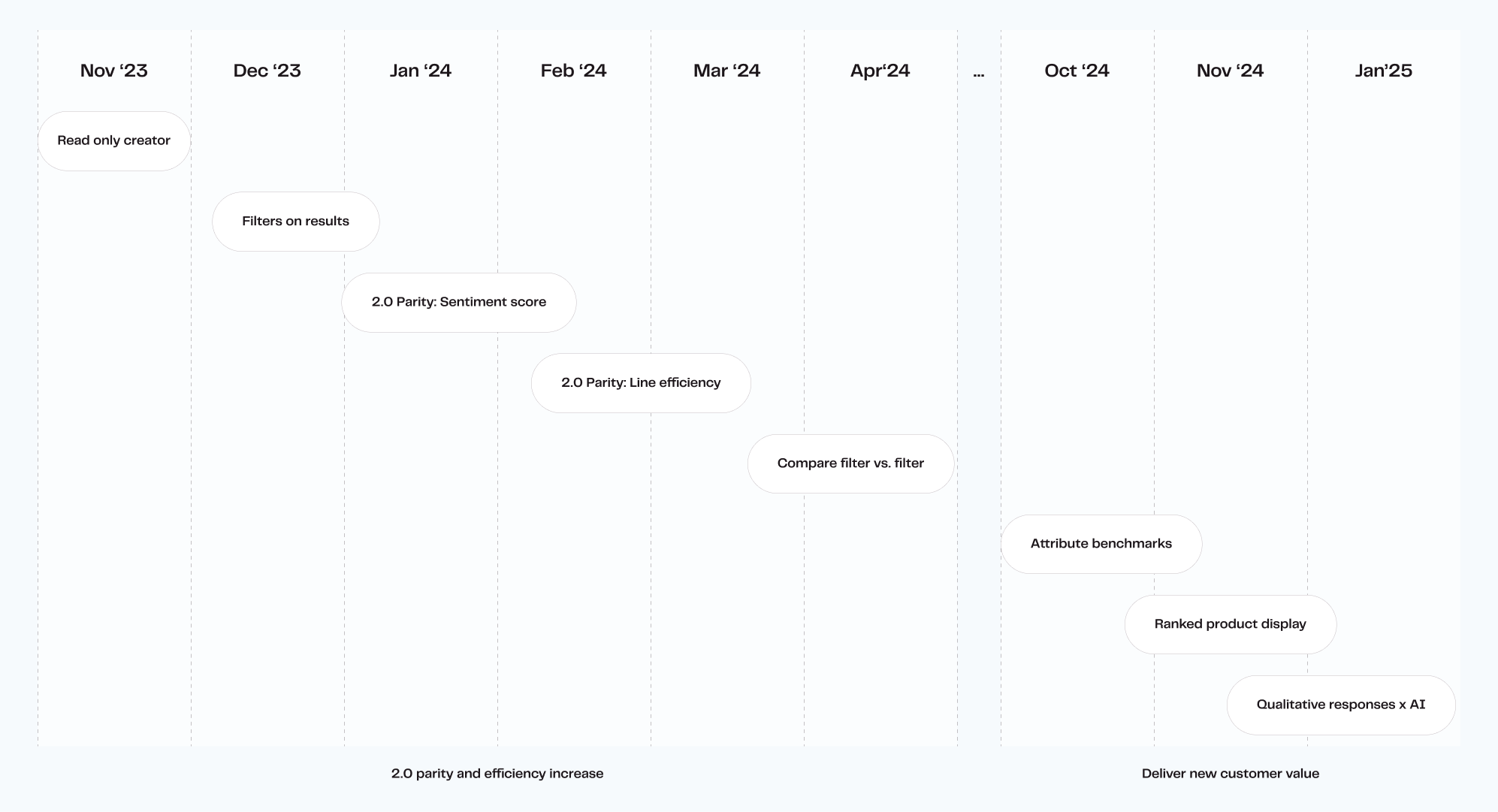
I was the lead designer on a team of three: Lena, a UX researcher, and Vasyl, a design system designer. Ten months total, with iterative delivery across two phases: first parity and efficiency, then new customer value.
My scope covered product strategy, user research, interaction design, data visualization, and design system. I worked across three user types simultaneously: internal Customer Ops, Brand Insights Managers, and Brand Merchants. Each had different goals and different points of breakdown.
I advocated for user insights to prioritize the right features and ran impact/effort workshops with the team to keep focus on the highest-value work. Research from user sessions directly shaped which features shipped in which order. The incremental approach was a deliberate choice: early wins built momentum and created internal champions for 2.0 adoption before we'd finished everything.
In 1.0, users could only analyze three question types with a single chart option, which limited how they explored their data. In 2.0, we expanded support to ten question types and five visualization styles, and added richer views for sentiment scores and line efficiencies.
Why it matters: This gave both internal teams and customers the flexibility to represent results in ways that matched their decision-making, moving beyond “one-size-fits-all” charts.

The old layout buried insights under sidebars and tabs. In 2.0, we introduced a dedicated Survey Insights area that highlights key takeaways first, while restructuring navigation to mirror the report formats used by our retail customers.
Why it matters: Instead of hunting for meaning, users are guided directly to the insights they care about—building confidence in the tool and speeding up delivery.

Qualitative data is considered a “goldmine” for getting a “real read” on what people think about a product, colour, design, or topic. It is hard to collect and decipher at scale; reading through thousands of open ended responses to spot patterns. In 2.0, we introduced LLM-powered summarization to automatically surface themes across qualitative data.
Why it matters: What used to take hours of manual review can now be scanned in minutes, giving teams more time to interpret patterns and deliver richer insights.

Analysis in 1.0 often meant exporting to Excel and creating pivot tables by hand. In 2.0, we added aggregation, side-by-side comparison, and grouped filters directly into the platform.
Why it matters: Internal teams can now run comparisons across products and questions without leaving the tool, cutting down hours of repetitive work and making analysis accessible to non-technical users.

Our Customer Operations team—the main users of Survey Results—struggled with clunky workflows and had to build client decks manually. Without deeply understanding their process, we risked designing solutions that missed the mark.
I embedded with the team by joining their weekly standups, shadowing their projects, and reviewing hundreds of their final Insight Report decks. This gave me visibility into both their workflow bottlenecks and the customer-facing expectations.
By grounding product priorities in their day-to-day reality, I was able to advocate for features that directly reduced their pain and aligned better with what customers needed to see in reports.

The scope was too large to solve all at once, and our small team risked spreading efforts thin. If we didn’t deliver value quickly, adoption of 2.0 would stall.
I worked with the product triad to break the work into epics—starting with productizing 1.0 flows so we had continuity, then layering in new analysis features once the foundation was stable. I facilitated prioritization workshops to help the team weigh impact vs. effort, ensuring focus stayed on what mattered most.
This incremental approach allowed us to ship meaningful improvements early, maintain momentum, and build trust with internal users—who in turn became champions for adopting the 2.0 results experience.
Introduce collapsible sidebars
To maximize the data view’s real estate, we made the navigation and filter sidebars collapsible. Given that most surveys include at least 15 products, we also introduced a full-screen mode, ensuring all products are visible without being cut off in a smaller view.
Users could now scan entire surveys without distraction, reducing scrolling and improving efficiency when comparing many products at once.

Compare toggle in the sidebar
Comparing data across products or questions required multiple manual steps and was confusing for users.
I explored several comparison layouts and, together with our UX researcher, tested usability, chart comprehension, and navigation. The solution—a clear Compare toggle in the sidebar—proved discoverable and effective.
Users could now easily compare across all questions at once, improving clarity and reducing reliance on external Excel pivot tables.

Prioritize displaying ranked product images
From my regular conversations with the Customer Operations team, I learned that customers value product visuals more than constant chart-based representations. By the time this feature was prioritized, I had already gathered key insights on what was needed for its design. I advocated for giving users control over the size of product tiles, allowing them to customize their view in the Insight Report.
Insights become more visual without losing the data, helping merchandising teams make decisions faster.

While we were redesigning, the company went through a marketing rebrand, which risked creating inconsistency between software and customer-facing materials.
I led the rebrand updates for the product, partnering with marketing and engineers to align both 1.0 and 2.0 platforms with the new identity. This included creating a unified, accessible color palette, updating the typescale, and refining design system components—especially data visualization elements.
This ensured the platform reflected our new brand identity, reinforced credibility in front of enterprise clients, and created consistency across both 1.0 and 2.0 during the transition.

Mapping how Customer Ops actually worked showed that the reports handed to brands were as much the problem as the software that built them. Fixing the tool and leaving the reports alone would have solved half the experience.
I went deep enough on both 1.0 and 2.0 to connect Results, Creator, and Taker flows across them without opening new gaps, so customers could move onto 2.0 gradually instead of all at once. That meant knowing the platform I wasn't redesigning almost as well as the one I was.
I flexed between craft, product strategy, and facilitation depending on the week: took a Product Strategy for Designers course, ran workshops (some didn't land), and went deep enough on engineering to talk trade-offs directly with the team. Influence came as much from being clear and easy to work with as from the design itself.
Senior Product Designer with a business and marketing background. Driving vision through validated insights, fast collaboration, and prototyping with care.


.png)